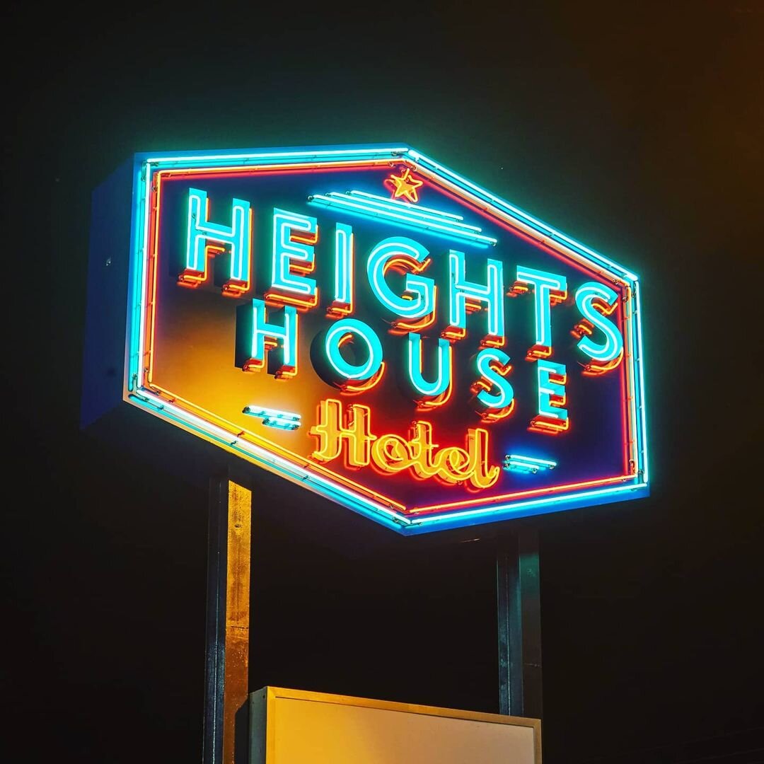
The House Heights Hotel neon sign is a striking blend of vintage charm and modern elegance, designed to capture the vibrant energy of Houston, Texas. Featuring a bold yet refined typeface, the sign glows with a warm, inviting ambiance, evoking a sense of classic hospitality with a contemporary twist. Carefully selected neon colors—rich, warm whites with accents of deep amber and electric blue—enhance its visibility while maintaining a timeless, upscale aesthetic.
The design pays homage to historic hotel signage, with a balance of retro curves and clean lines, making it a true landmark both day and night. Mounted on a sleek metal framework, the glowing letters cast a subtle halo effect, creating a dynamic visual presence against the Houston skyline. This neon sign doesn’t just mark a location—it sets the mood, welcoming guests with a nostalgic yet fresh sense of place.
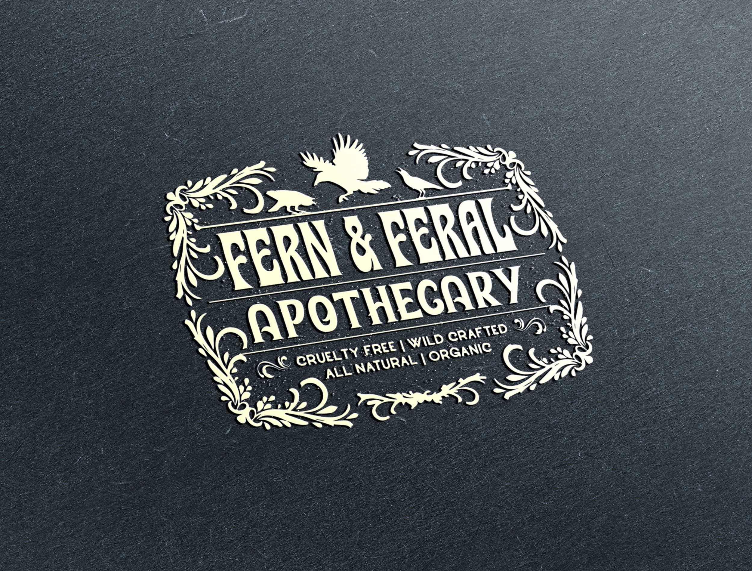
The Fern & Feral Apothecary label is a beautifully crafted design that captures the brand’s wild, botanical essence. Delicate yet organic, it features intricate illustrations of ferns and other natural elements, evoking a sense of untamed beauty and herbal wisdom. The typography blends elegance with a handcrafted feel, reinforcing the brand’s artisanal approach. A rich yet earthy color palette enhances the label’s apothecary aesthetic, making it feel both timeless and modern. Every detail—subtle textures, balanced composition, and refined accents—contributes to an overall design that embodies nature’s wild sophistication and the brand’s commitment to holistic, plant-based remedies.
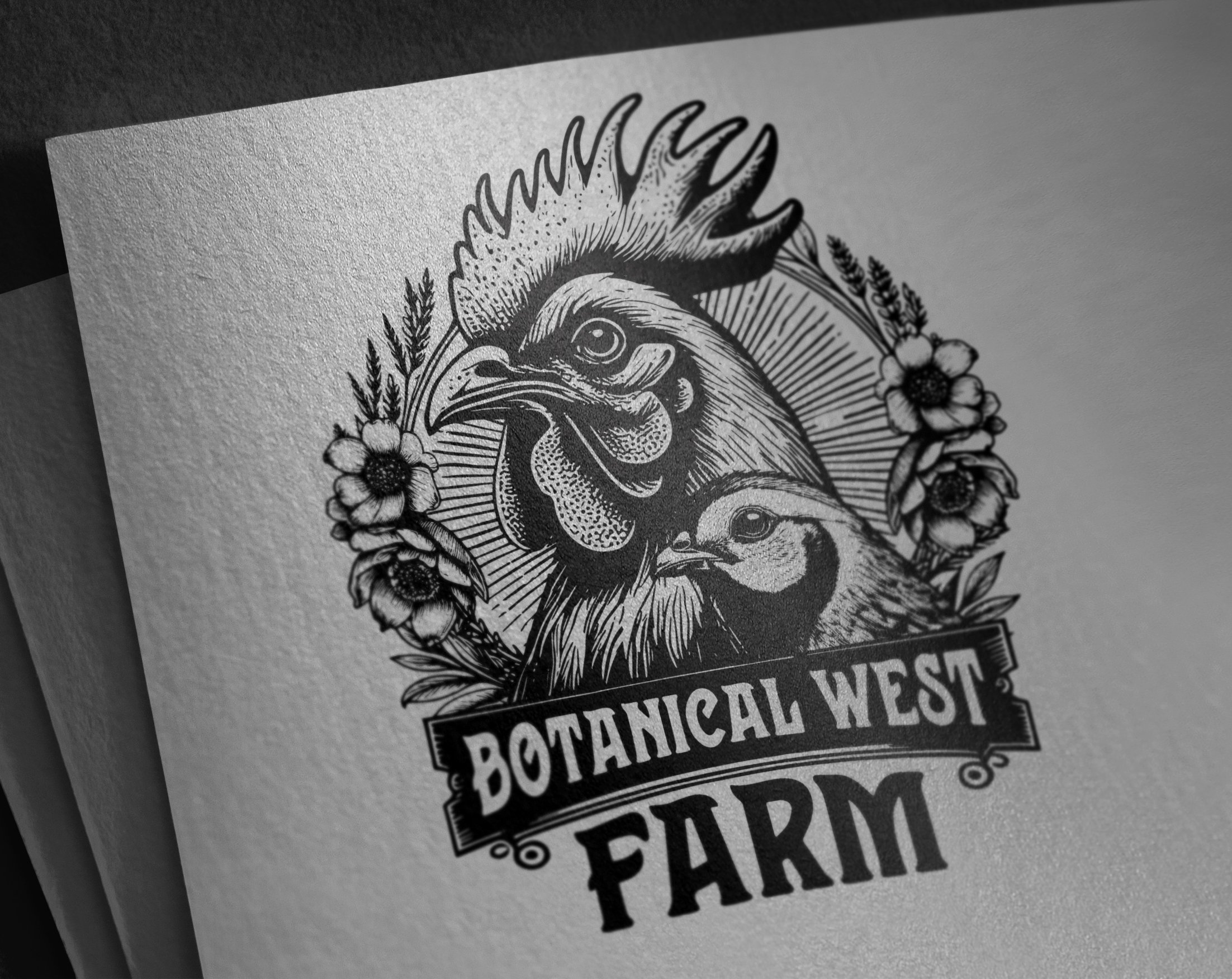
The Botanical West Farm logo is a beautifully organic design that reflects the farm’s deep connection to nature and its local environment in Victoria, BC. Featuring delicately illustrated native plants, the logo showcases the farm’s dedication to sustainability and regional agriculture. Quails and chickens, thoughtfully integrated into the design, add a charming, rustic touch, symbolizing the farm’s commitment to ethical and natural farming practices. The composition balances elegance and warmth, with an earthy color palette that enhances its authenticity. This logo embodies the essence of Botanical West Farm—local, natural, and thriving with life.
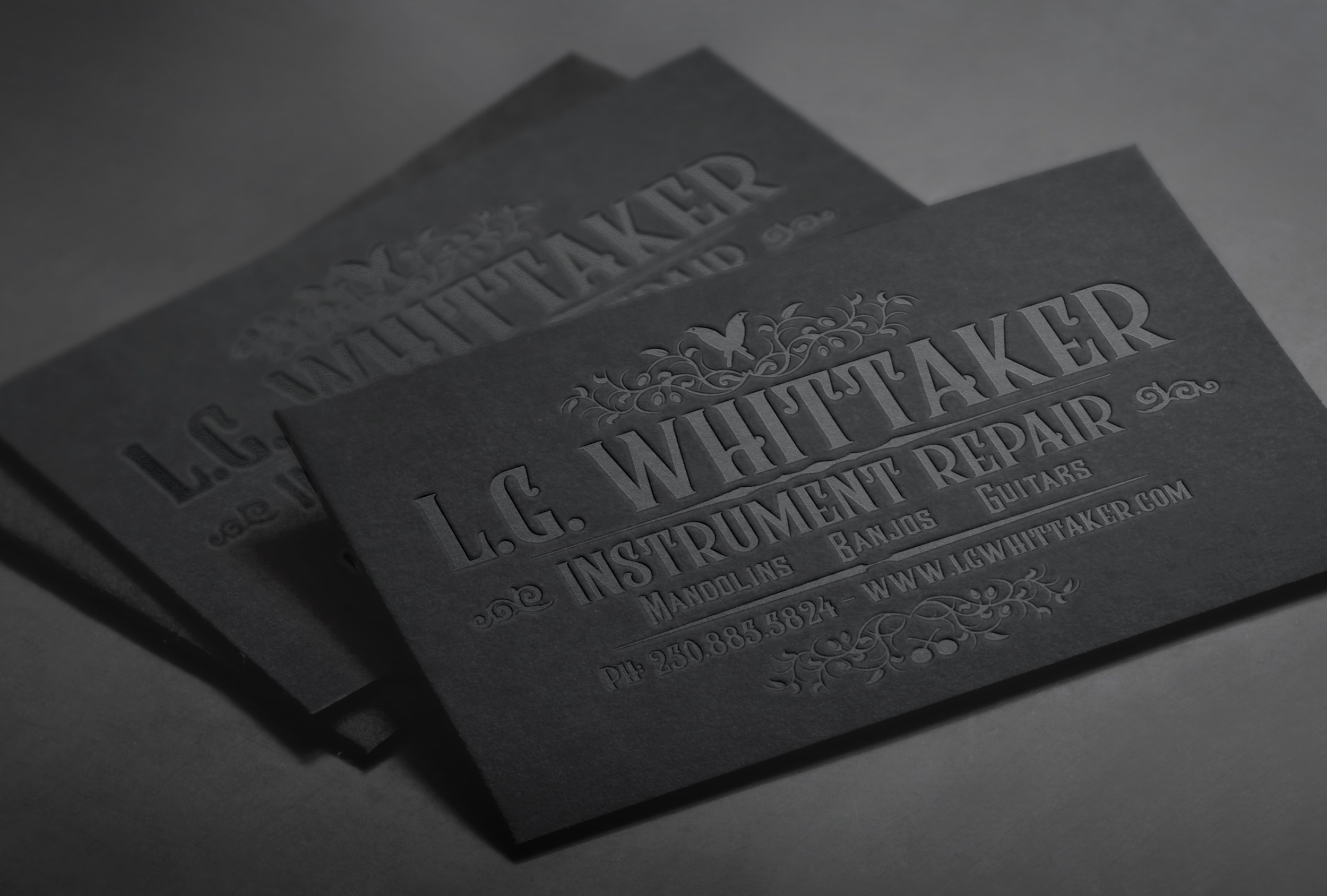
The L.G. Whittaker Instrument Repair business card is a masterclass in understated elegance and craftsmanship. Designed with a black-on-black letterpress technique, the card exudes a sense of sophistication and depth, allowing the tactile impressions to play with light and shadow. The carefully selected typography and subtle detailing create a refined yet bold aesthetic, perfectly aligning with the precision and artistry of instrument repair.
This striking design gained industry recognition in 2019, when it was featured in Creative Bloq Magazine’s “40 Inspiring Examples of Letterpress Business Cards.” Its ability to merge minimalism with luxury made it a standout example of how texture and restraint can elevate a brand’s identity.
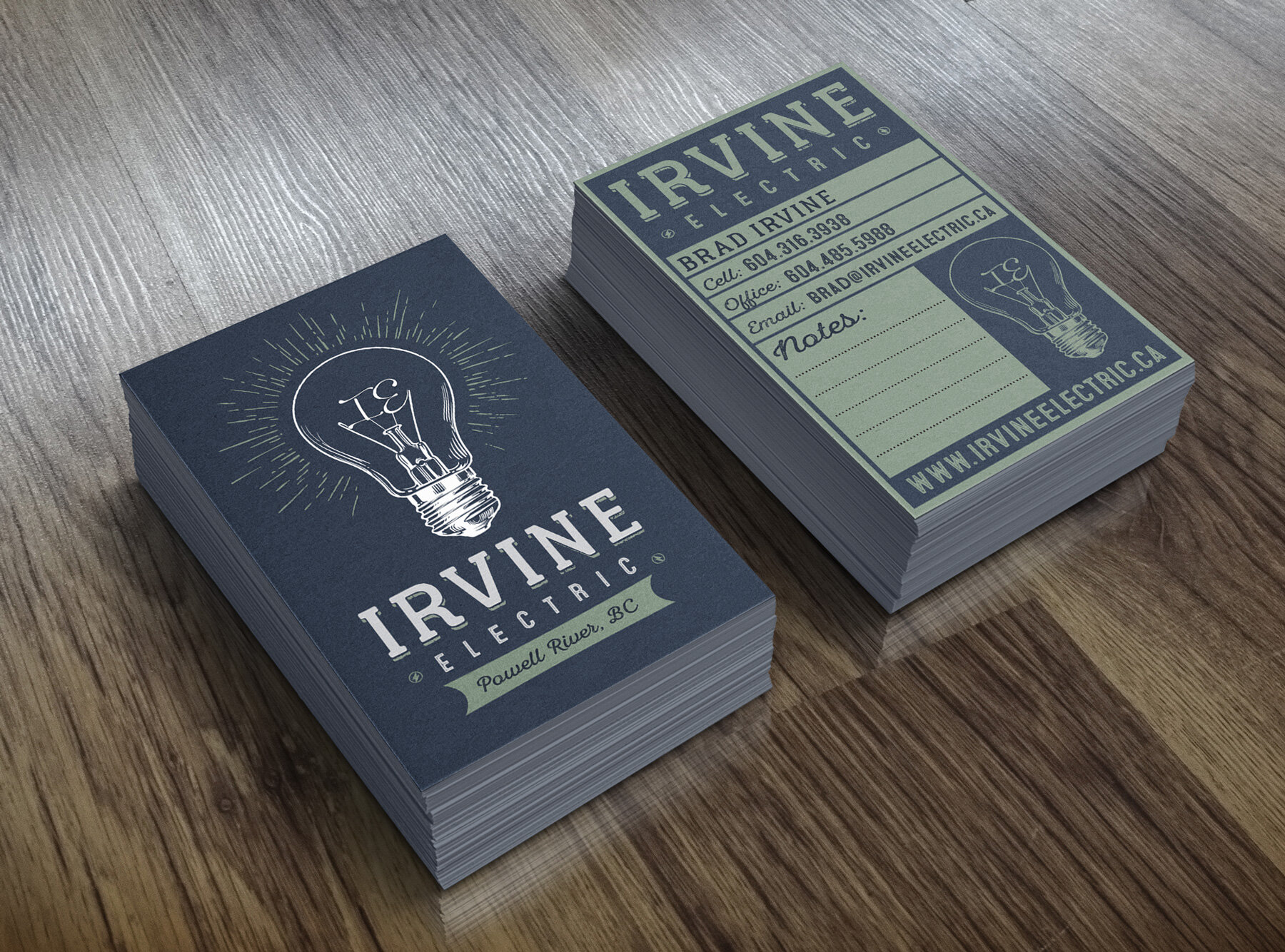
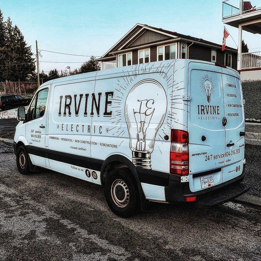
The Irvine Electric logo is a bold yet simple design featuring a clean lightbulb icon with subtly integrated "IE" initials, symbolizing power and precision.
The business card maintains this striking simplicity, with a crisp front showcasing the logo and a thoughtfully designed back that includes extra space for customers to write down appointments or notes. Printed on sturdy stock, it’s both professional and practical, ensuring a lasting impression.
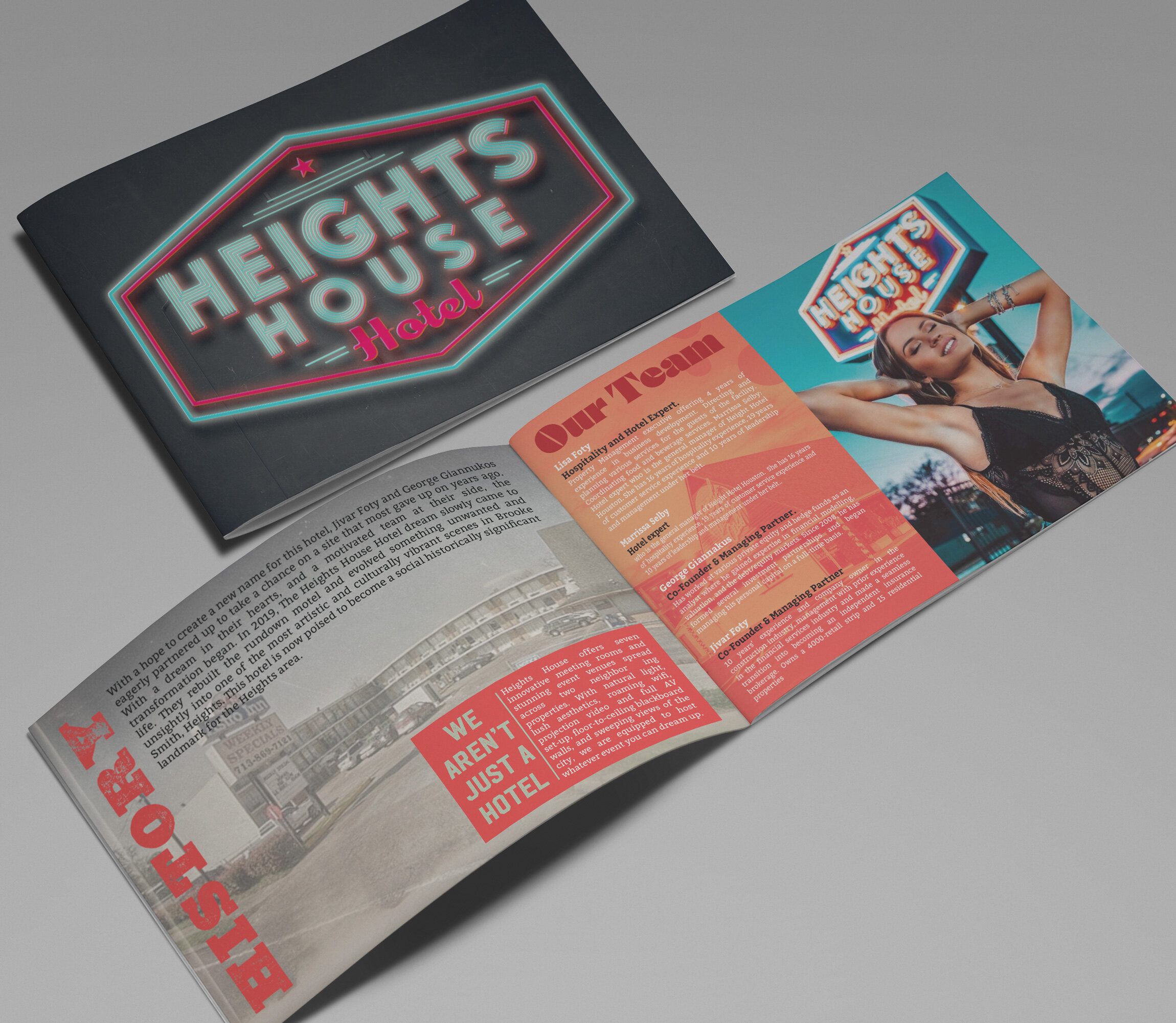
The Heights House Hotel brochure marries vintage charm with modern elegance, beautifully illustrating the transformation of this historic hotel. Rich blues, warm neutrals, and gold accents infuse the design with luxury, while high-quality imagery highlights the revamped interiors and lush outdoor areas. The thoughtful use of these elements creates a sense of timeless appeal, tying the hotel’s storied past to its exciting new chapter. Every detail in the brochure—from layout to typography—reflects the hotel’s sophistication, promising guests a stay steeped in both history and comfort.
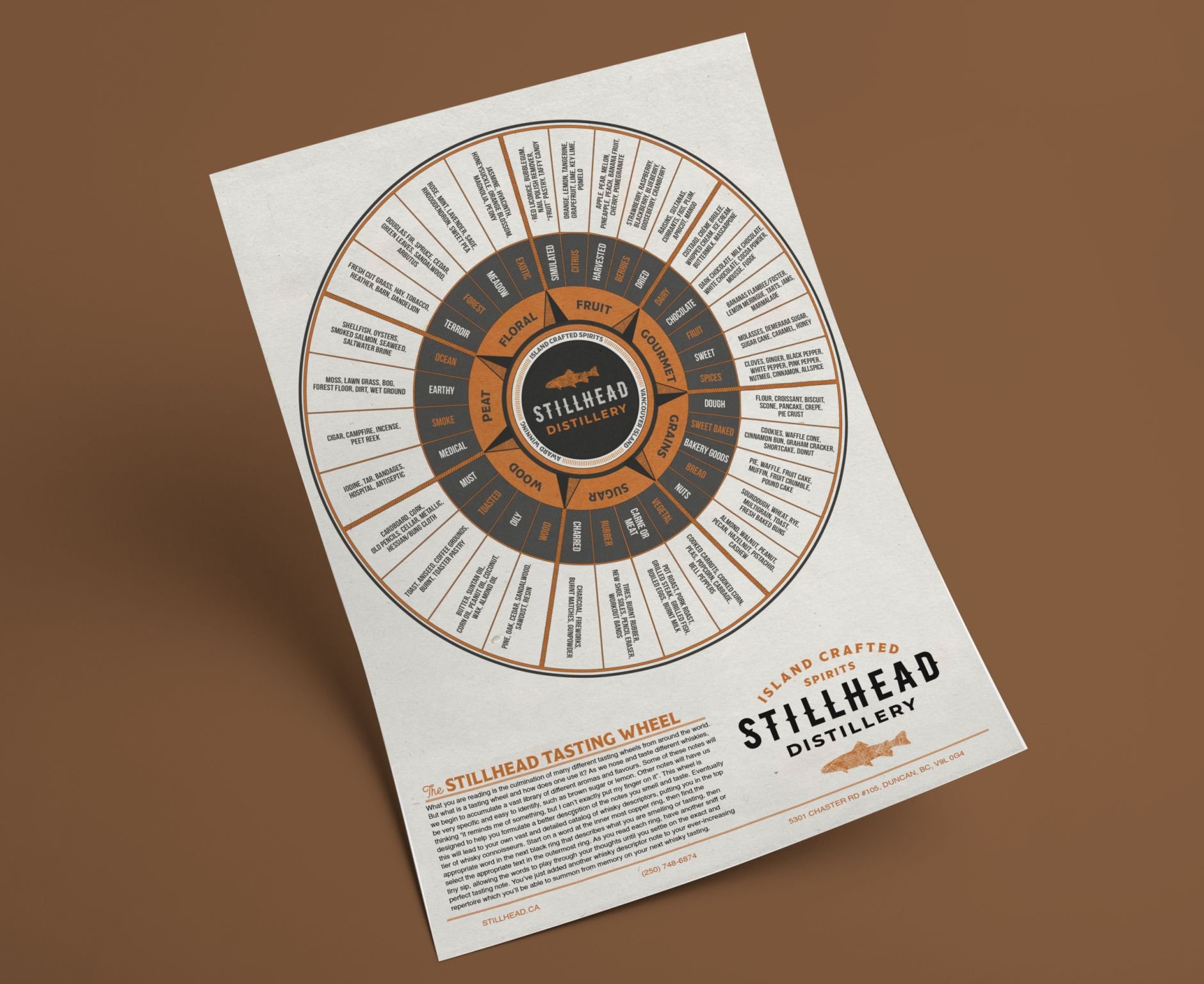
The infographic tasting wheel designed for Stillhead Distillery maintains strict adherence to the brand's visual standards, ensuring consistency with the brand’s identity. The layout is sleek, clear, and visually appealing, with copper tones that align perfectly with the distillery's rich and warm branding. The use of these elegant copper hues adds a sense of premium quality, while the wheel itself is designed to guide customers through the tasting experience in a way that’s both informative and engaging, reflecting the distillery’s craftsmanship.
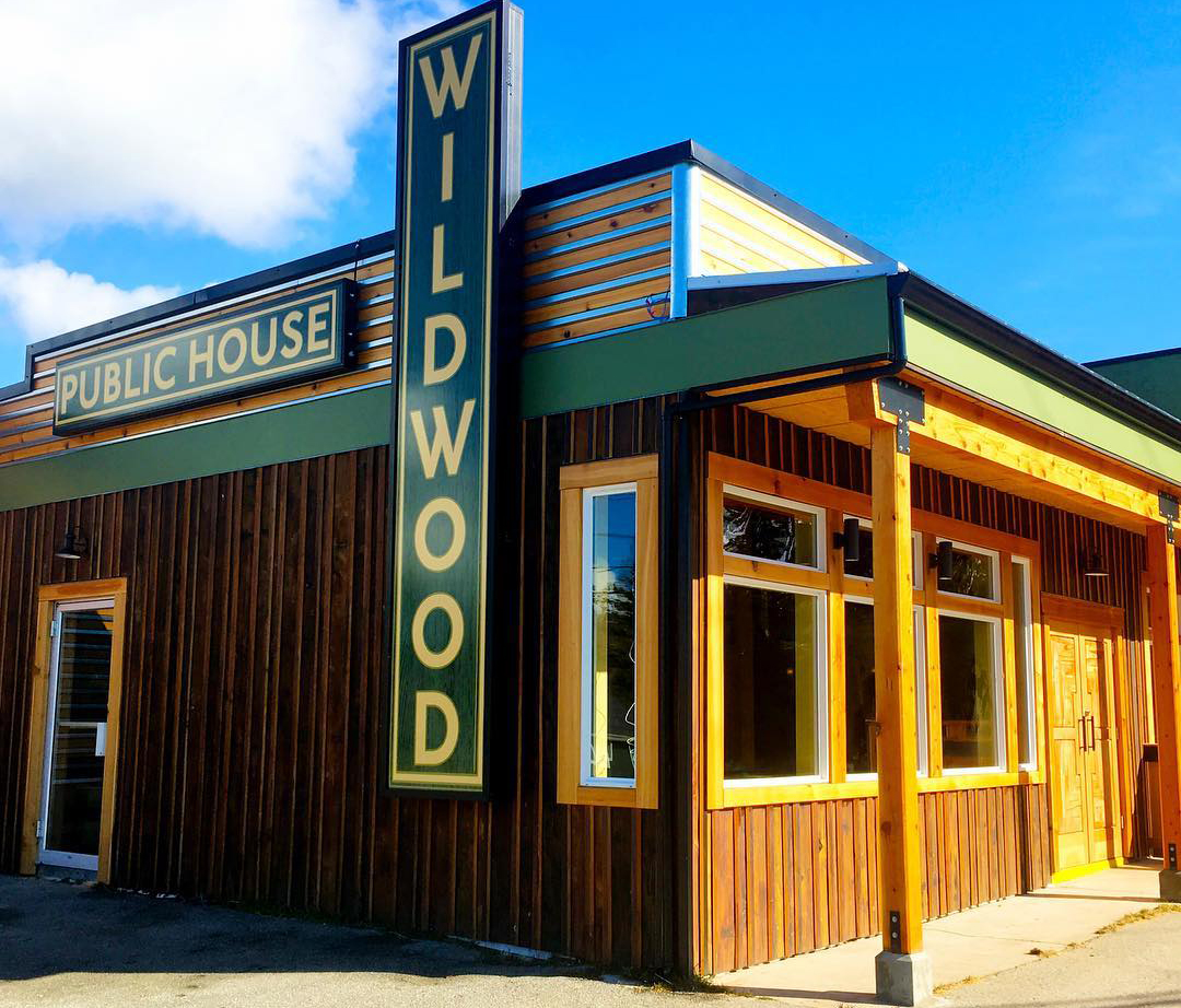
The Wildwood Pub signage reflects the transformation of a once-dated dive bar into a vibrant, welcoming pizzeria and pub. The earthy tones and hand-drawn details symbolize both rustic charm and a modern, rejuvenated atmosphere. The design connects the past with the present, creating a sense of community and warmth, making the pub a fresh, inviting local hotspot.
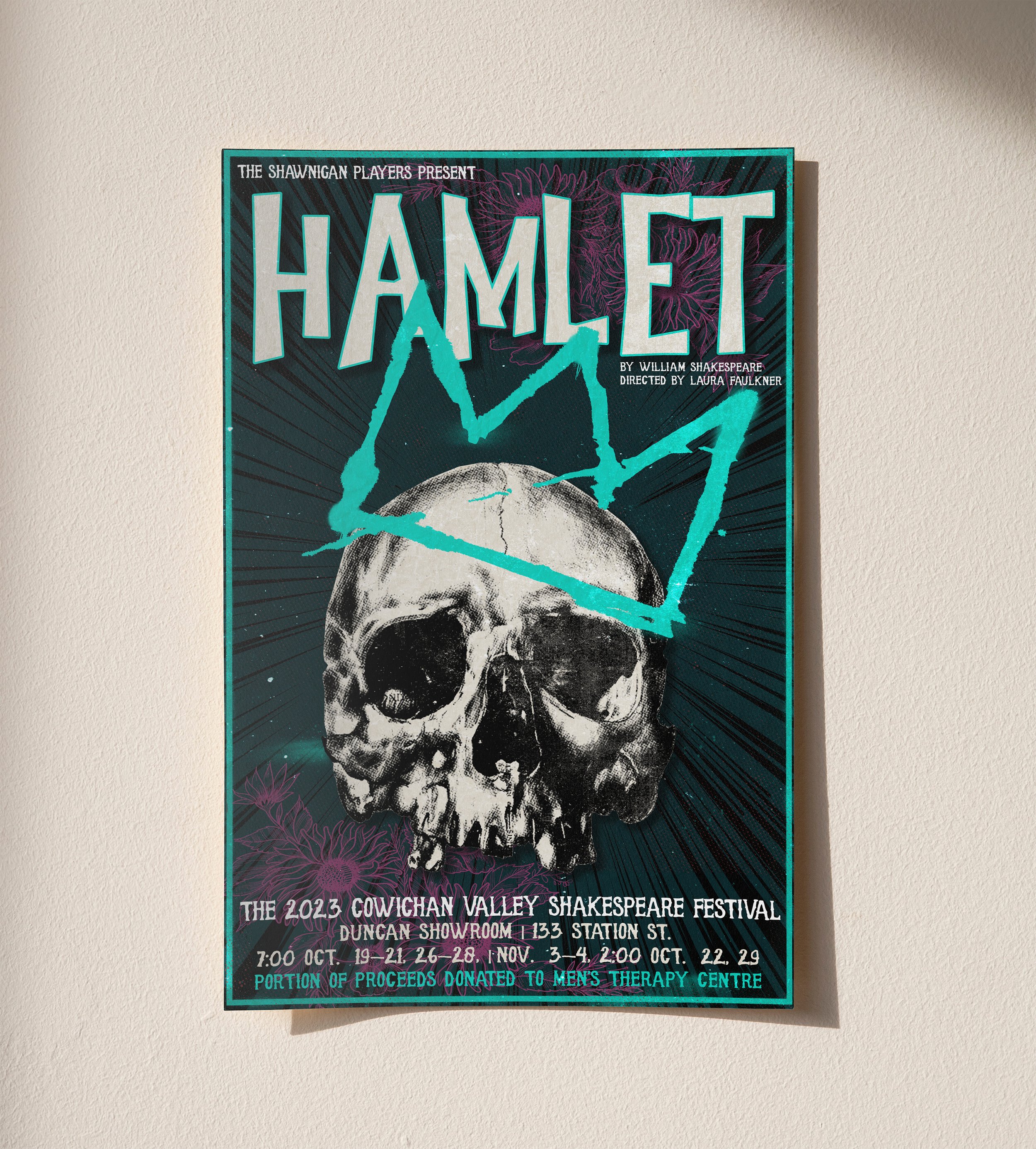
The Hamlet poster for the Shawnigan Lake Players is a bold reimagining of Shakespeare’s tragedy, blending modern urban aesthetics with the play’s iconic skull imagery for a striking, unforgettable design.
The Process:
I started with the core visual—the skull, a universally recognized symbol of mortality and Hamlet’s existential struggle. Instead of a traditional, classical approach, I infused it with a raw, urban edge, incorporating elements like gritty textures, bold graphic contrasts, and dynamic negative space to give the poster a contemporary feel.
The typography follows suit, mixing sharp, modern sans-serifs with distressed or hand-drawn letterforms, echoing street art or punk rock posters. The color contrast is high-impact, possibly stark black and white with bold, dramatic red accents, drawing immediate attention while reinforcing the themes of blood, fate, and tragedy.
Layered details—perhaps subtle halftones, ink splatters, or fragmented imagery—add depth, making the design feel visceral and cinematic. The final composition ensures that, whether viewed from afar or up close, the poster is as gripping as the play itself—bold, moody, and unforgettable.
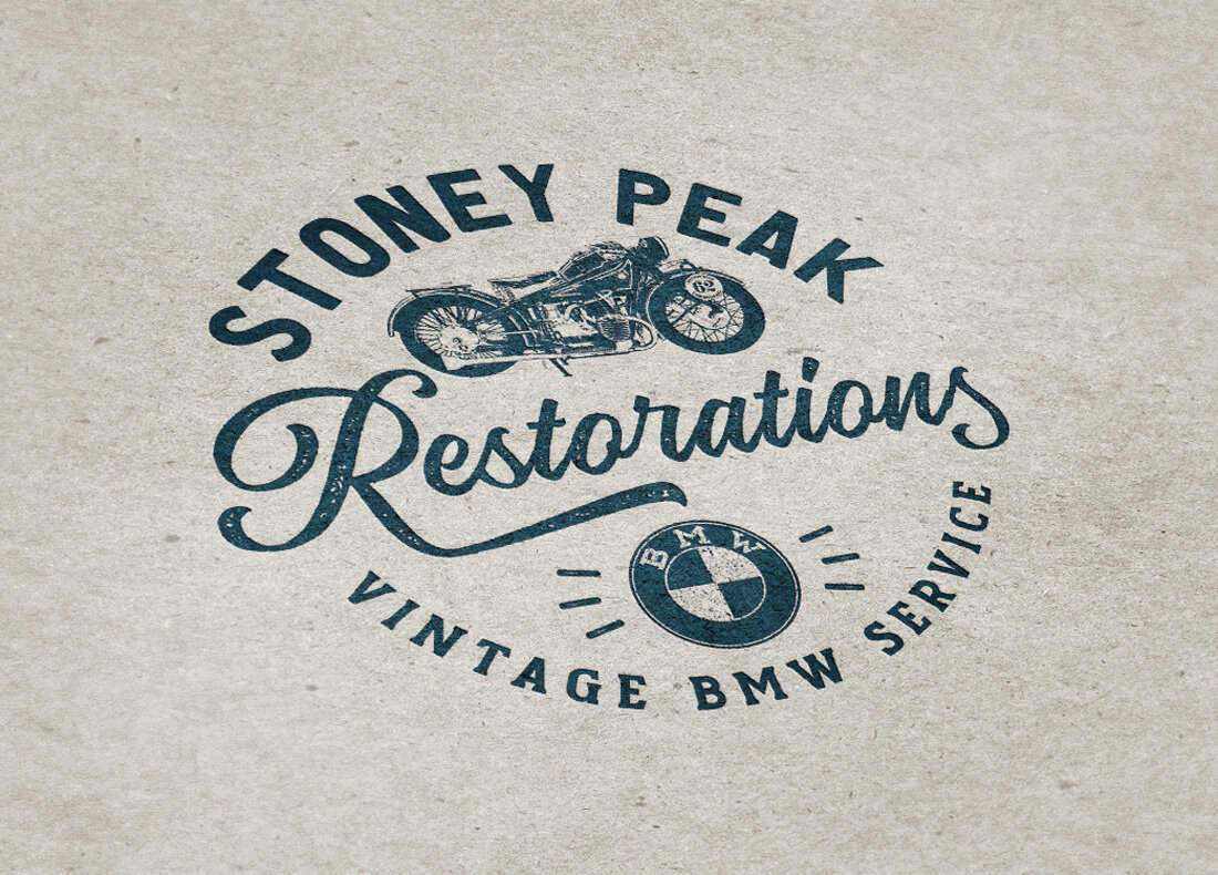
The Stoney Peak Restorations logo cleverly incorporates vintage BMW motorcycle elements. Using the iconic old-school BMW logo and an illustration of a classic motorcycle, it highlights the company’s focus on restoring vintage BMW bikes. The design combines the essence of precision engineering with the timeless appeal of these iconic machines, showcasing their expertise in motorcycle restoration. The logo evokes a sense of nostalgia while symbolizing craftsmanship and dedication to preserving the legacy of vintage BMW motorcycles
Logo Design & Branding: Logic League Consulting Co.
’Reimagining Emergency Management in British Columbia’
Vancouver Island, British Columbia
Web Site
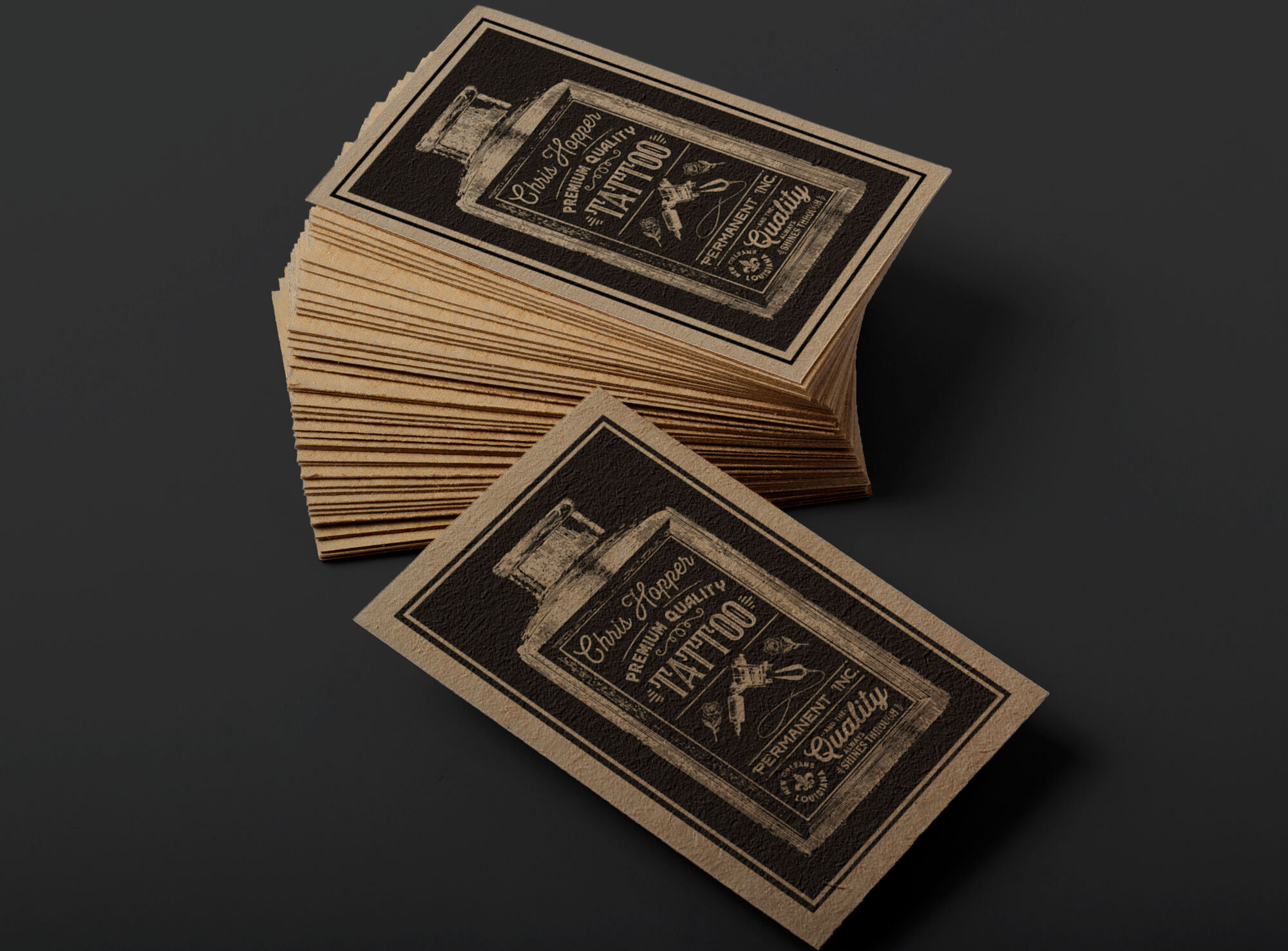
The Chris Hopper Tattoos business card is a perfect blend of old-world craftsmanship and rugged authenticity, designed to reflect both the artistry and permanence of tattooing. At its core, an antique ink bottle illustration serves as a striking visual frame for the card’s key information—its intricate detailing giving a vintage apothecary feel, while also subtly referencing the tools of the trade.
Printed on rugged, natural paper stock, the card has a rich, tactile quality that enhances its handcrafted appeal. The slightly textured surface, combined with an off-set printed look, gives the design an intentionally imperfect, aged aesthetic—evoking the feel of old letterpress prints or vintage shop signage. The result is a business card that doesn’t just share contact details but tells a story of artistry, tradition, and timeless craftsmanship—just like a great tattoo.The Chris Hopper Tattoos business card is a perfect blend of old-world craftsmanship and rugged authenticity, designed to reflect both the artistry and permanence of tattooing. At its core, an antique ink bottle illustration serves as a striking visual frame for the card’s key information—its intricate detailing giving a vintage apothecary feel, while also subtly referencing the tools of the trade.
Printed on rugged, natural paper stock, the card has a rich, tactile quality that enhances its handcrafted appeal. The slightly textured surface, combined with an off-set printed look, gives the design an intentionally imperfect, aged aesthetic—evoking the feel of old letterpress prints or vintage shop signage. The result is a business card that doesn’t just share contact details but tells a story of artistry, tradition, and timeless craftsmanship—just like a great tattoo.
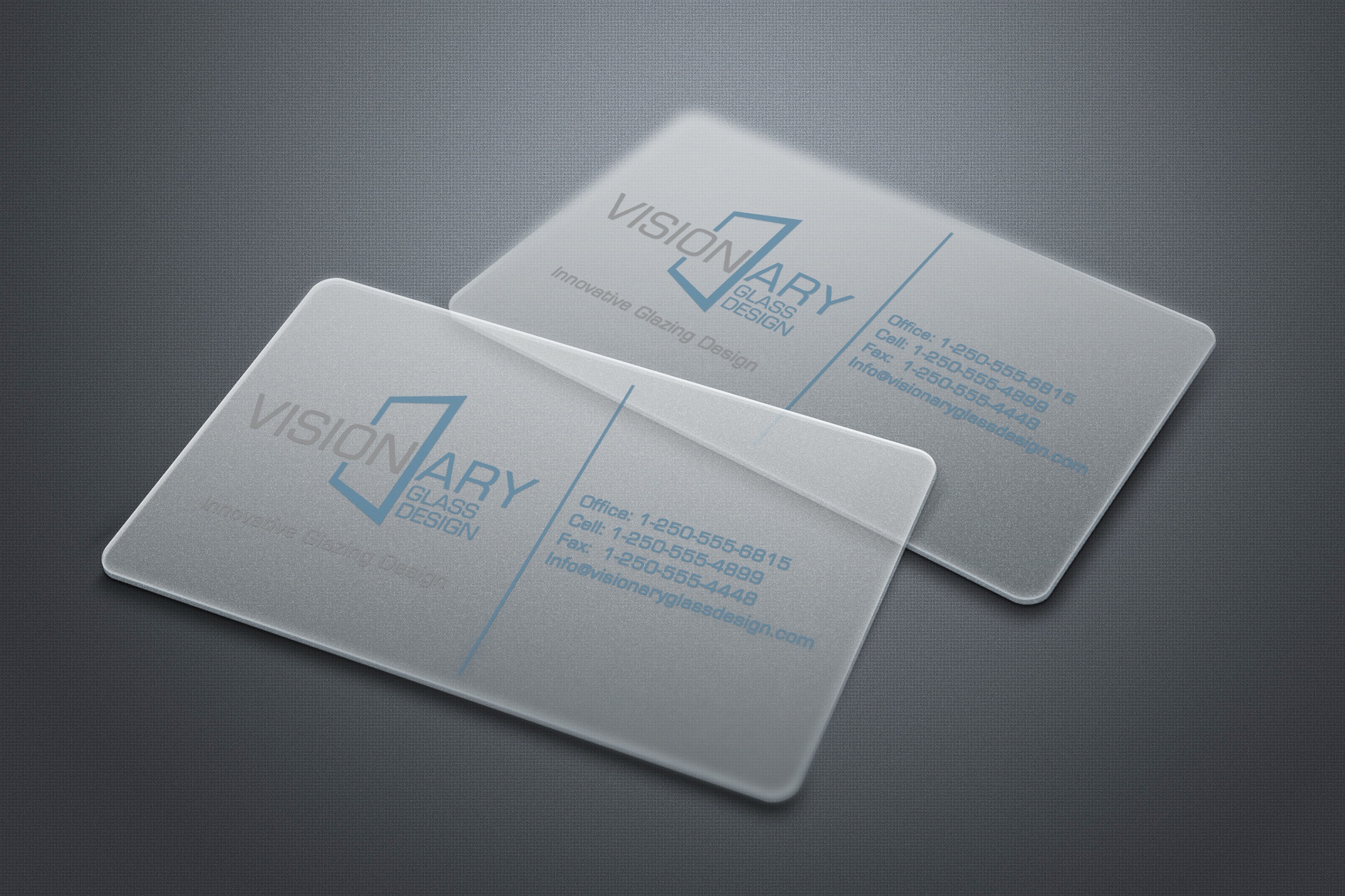
The Visionary Glass business cards are a striking fusion of design and material, embodying the company’s expertise in glass and windows through an innovative semi-opaque finish. The translucent quality of the cards creates an immediate visual and tactile connection to the brand, mimicking the way light interacts with frosted or architectural glass.
The logo design is equally refined, featuring subtle geometric shapes that subtly reference the structure of panes and frames. These elements are strategically incorporated, allowing the interplay of transparency and solid areas to reinforce the brand’s identity without overwhelming the minimalist aesthetic. The balance of crisp typography, negative space, and the layered depth of the material ensures that the card is not only visually memorable but also a perfect physical representation of Visionary Glass’s craftsmanship and innovation.

The QB Spa logo communicates luxury and tranquility through its minimalist approach. The soft, custom serif typeface paired with muted blues and golds evokes a sense of calm and sophistication, ideal for a wellness space. The clean lines and serene color palette create an inviting and timeless identity for the spa, positioning it as a premium destination for rejuvenation.
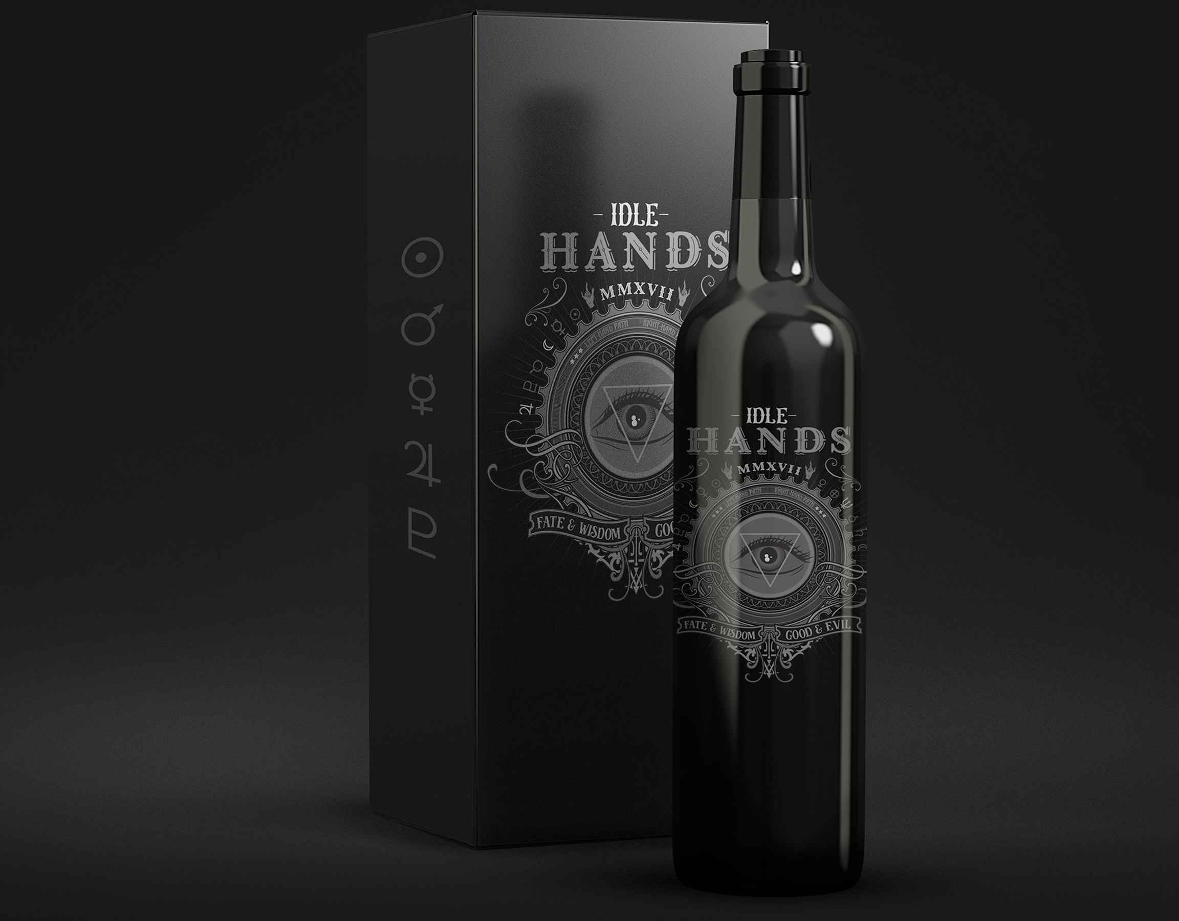
Packaging Design: Idle Hands Merlot
Vancouver Island, British Columbia
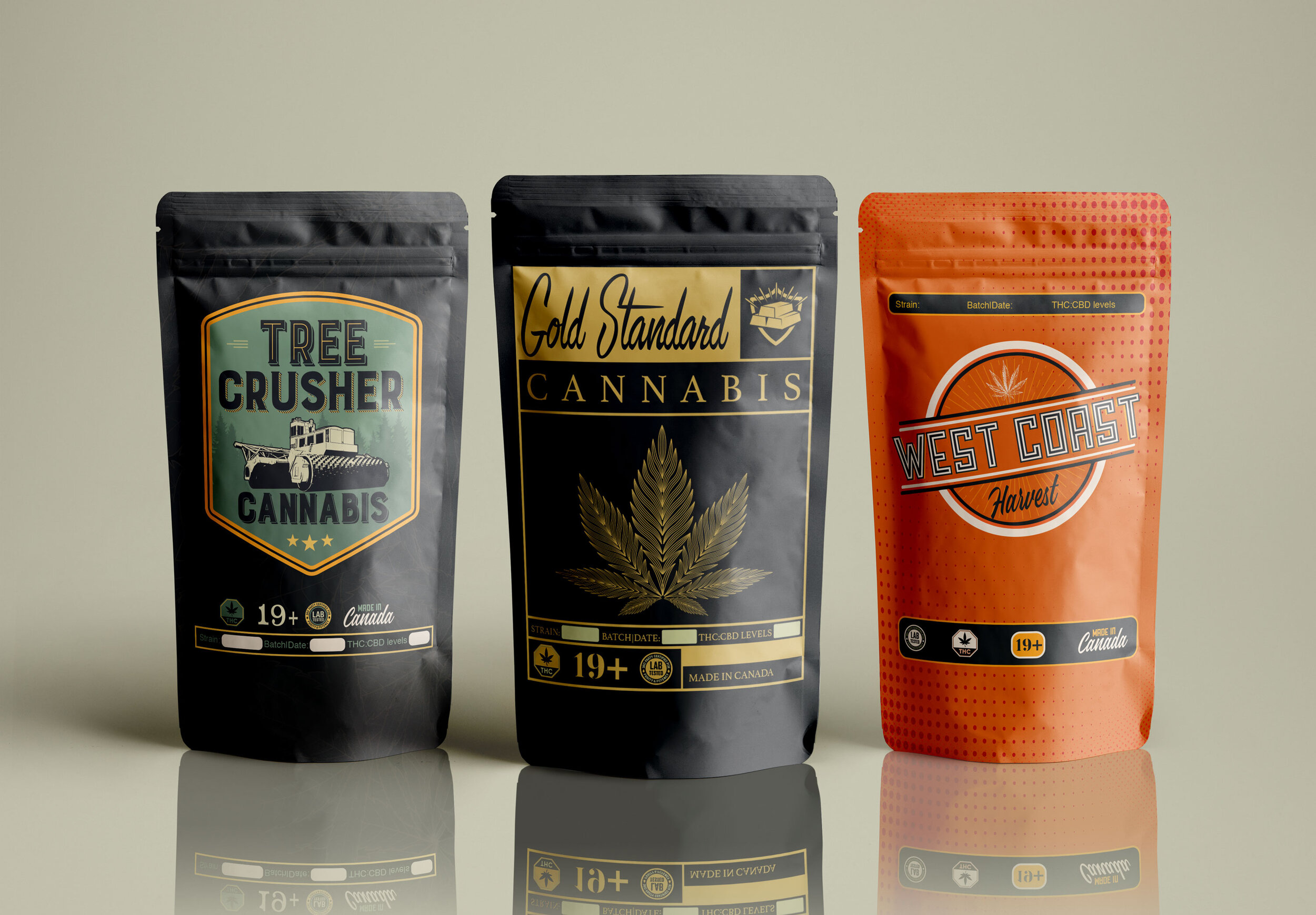
Package Design: Tree Crusher Cannabis
Mackenzie, BC
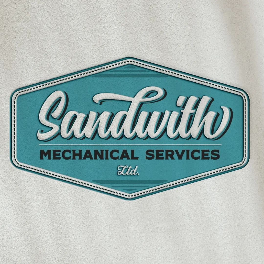
The Sandwith Mechanical logo merges vintage script with industrial design elements, reminiscent of the golden age of mechanics. The light blue and retro typography evoke nostalgia while maintaining a fresh, professional look. The flowing script and clean mechanical details make the logo approachable yet dependable, representing the company’s commitment to quality craftsmanship and innovation.
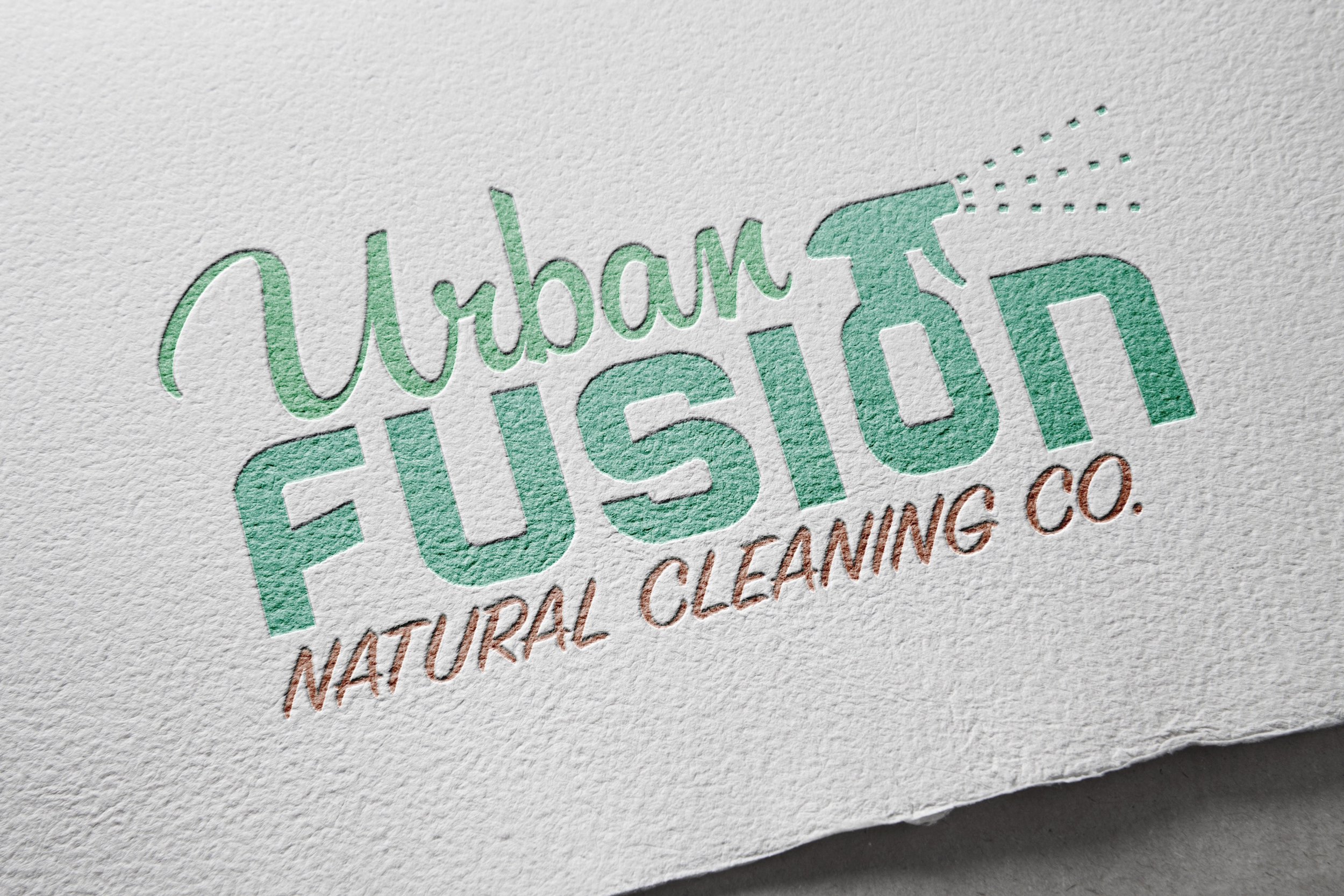
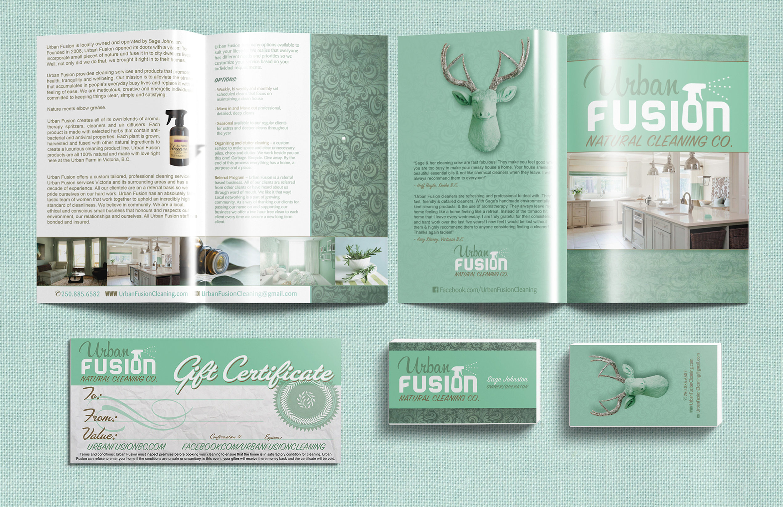
The Urban Fusion Cleaning logo combines classic sign painter-style typography with a modern twist, creating a blend of tradition and freshness that speaks to the heart of the business. The bold, vintage-inspired type lends a sense of reliability and craftsmanship, while the playful integration of a spray bottle into the 'o' in “fusion” creatively ties in the cleaning aspect of the business.
The use of pastel colors—soft blues, greens, and pinks—adds a clean, fresh feel that perfectly reflects the brand’s focus on providing a sparkling, welcoming service. The overall design strikes a balance between nostalgic charm and modern cleanliness, creating a logo that feels both approachable and professional while reinforcing the brand’s commitment to quality cleaning with a touch of personality.
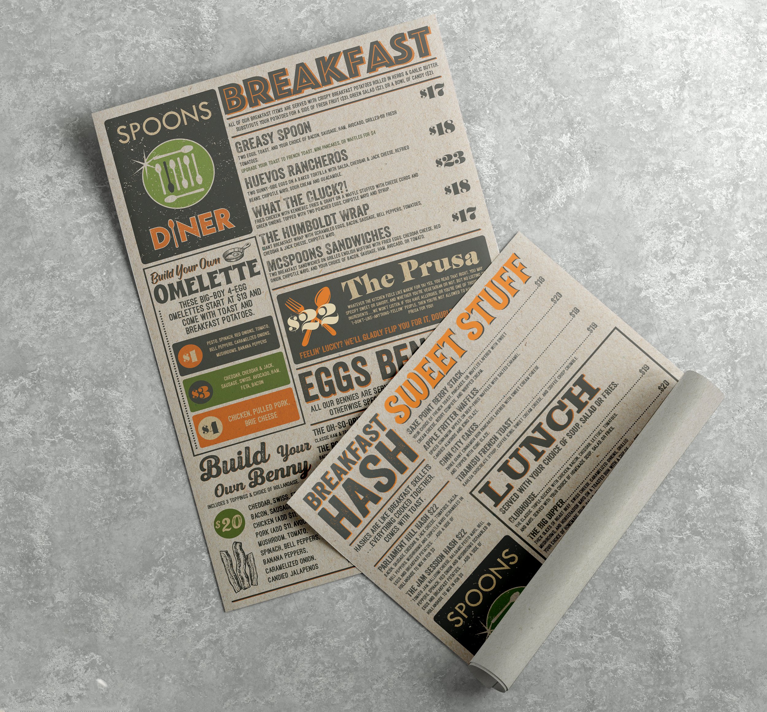
For Spoons Diner, the menu design is a vibrant homage to the diner’s retro roots, blended with modern sensibilities. The playful mix of green and yellow hues immediately catches the eye, evoking warmth and comfort, while the whimsical typography and illustrations enhance the nostalgic, friendly atmosphere. Designed for functionality as well as flair, the layout leads customers through the offerings with ease. The color palette and energetic composition communicate the diner’s fun-loving spirit, making this menu both an experience and a reflection of the inviting space.
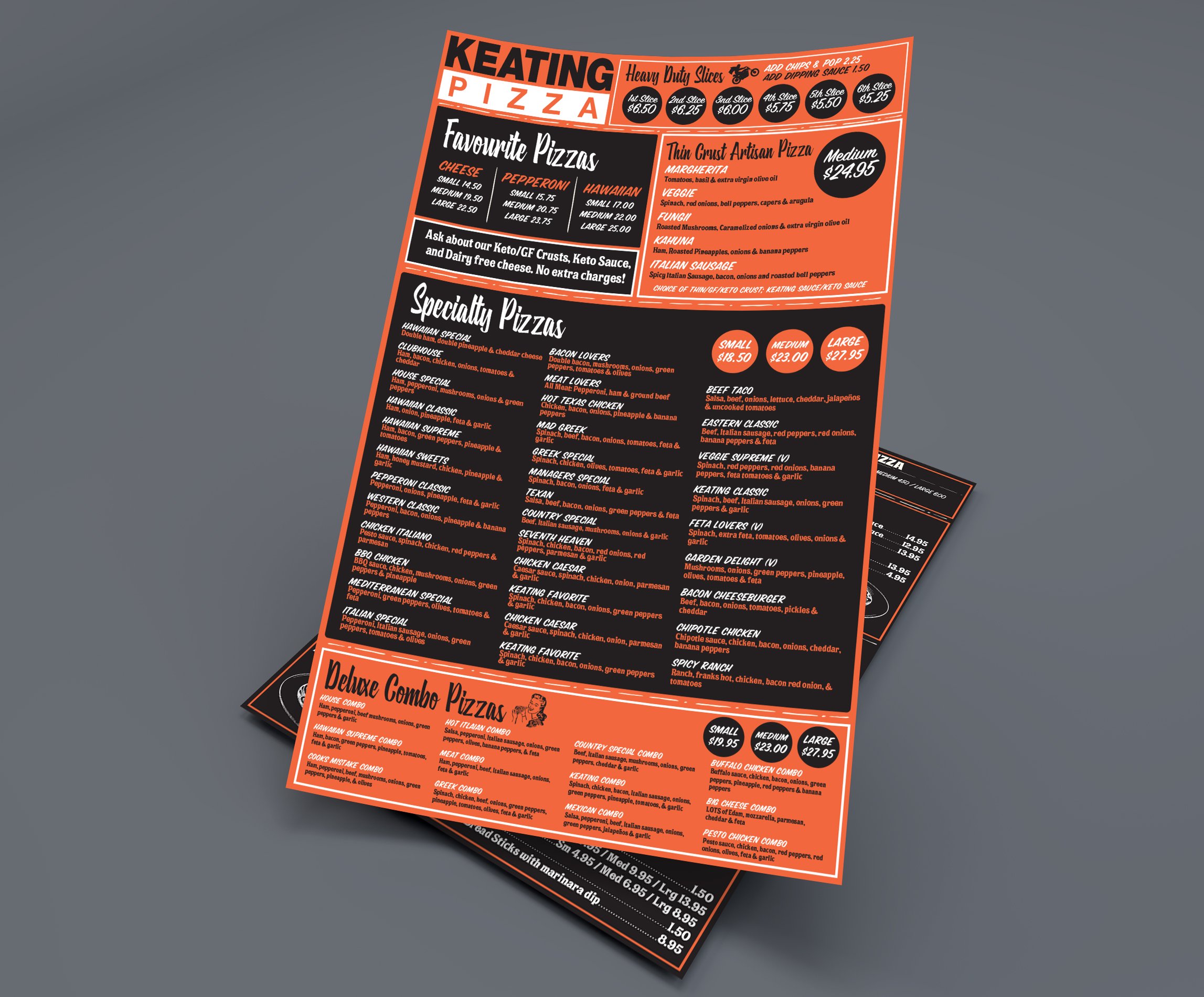
The Keating Pizza menu is a bold and visually striking design that perfectly balances vintage charm with modern energy. The layout is dynamic and engaging, guiding the eye effortlessly through the offerings with a mix of strong typography, playful arrangements, and well-placed accents. The bold orange, black, and white color scheme creates a high-contrast, eye-popping look that feels both classic and fresh. Vintage-inspired typefaces and subtle distressed textures give the menu a nostalgic, old-school pizzeria feel while maintaining a crisp, contemporary appeal. Every element—from the carefully chosen fonts to the structured yet lively layout—makes this menu as appetizing as the pizza itself.
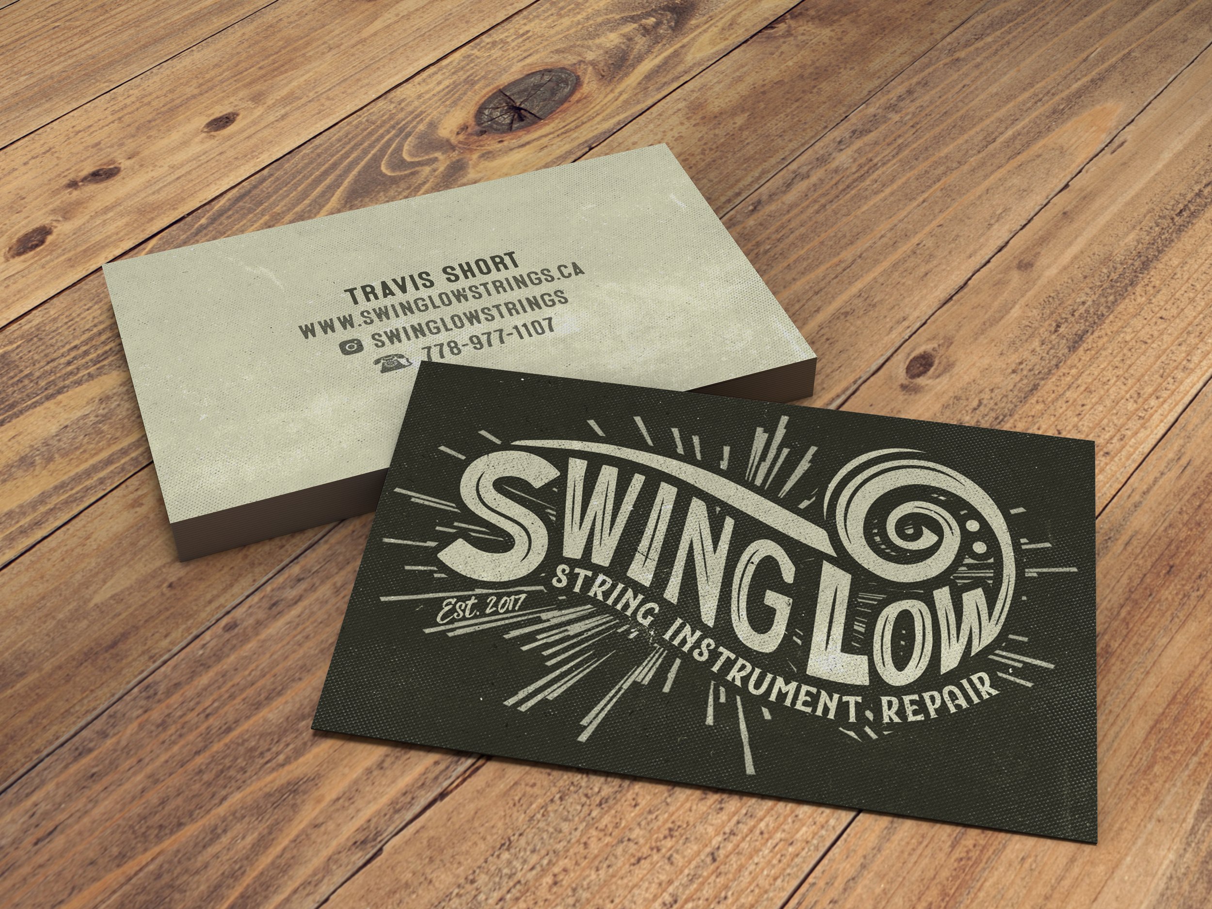
The Swing Low Strings logo and business card embody a perfect blend of handcrafted artistry and musical craftsmanship. The hand-drawn type gives the design a personal, artisanal feel, while the kinetic flourishes surrounding the text evoke the motion and precision of instrument repair. The flowing curves and intricate details within the design not only reflect the care and expertise behind the service but also have an almost block print aesthetic, lending a timeless, vintage quality to the brand.
The business card complements this design with a clean, simple layout, allowing the bold logo to take center stage. The text is clear and easy to read, while the organic, dynamic flourishes suggest movement and life, like the strings of an instrument being carefully tuned. The overall effect is both artistic and functional, embodying the essence of Swing Low Strings as a place where craftsmanship and creativity meet.
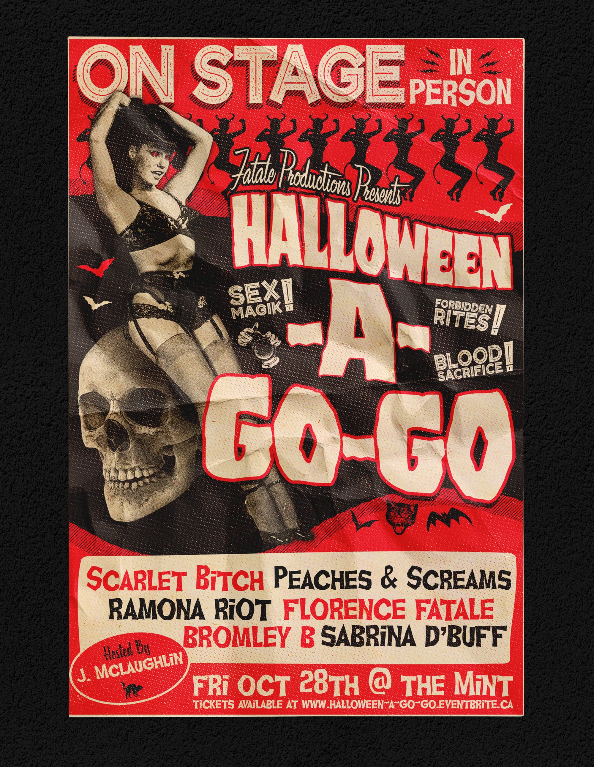
The "Halloween A Go-Go" poster is a dazzling fusion of vintage tease and classic spook show aesthetics, designed to electrify the senses and capture the playful allure of burlesque. Drenched in bold red and deep black, the color palette evokes the drama of old-school horror flyers while maintaining the sultry charm of mid-century go-go and pin-up culture.
The eye-catching imagery is a hypnotic mix of vintage-inspired typography, exaggerated motion lines, and striking silhouettes—channeling the energy of 1960s grindhouse posters. Bold, theatrical lettering and distressed textures enhance the retro appeal, while strategically placed eerie elements—a winking skull, swirling smoke, or a devilish femme fatale—add a touch of spooky seduction.
This poster doesn’t just announce a show—it commands attention, tempts curiosity, and sets the stage for a night of thrills, chills, and tantalizing tease.
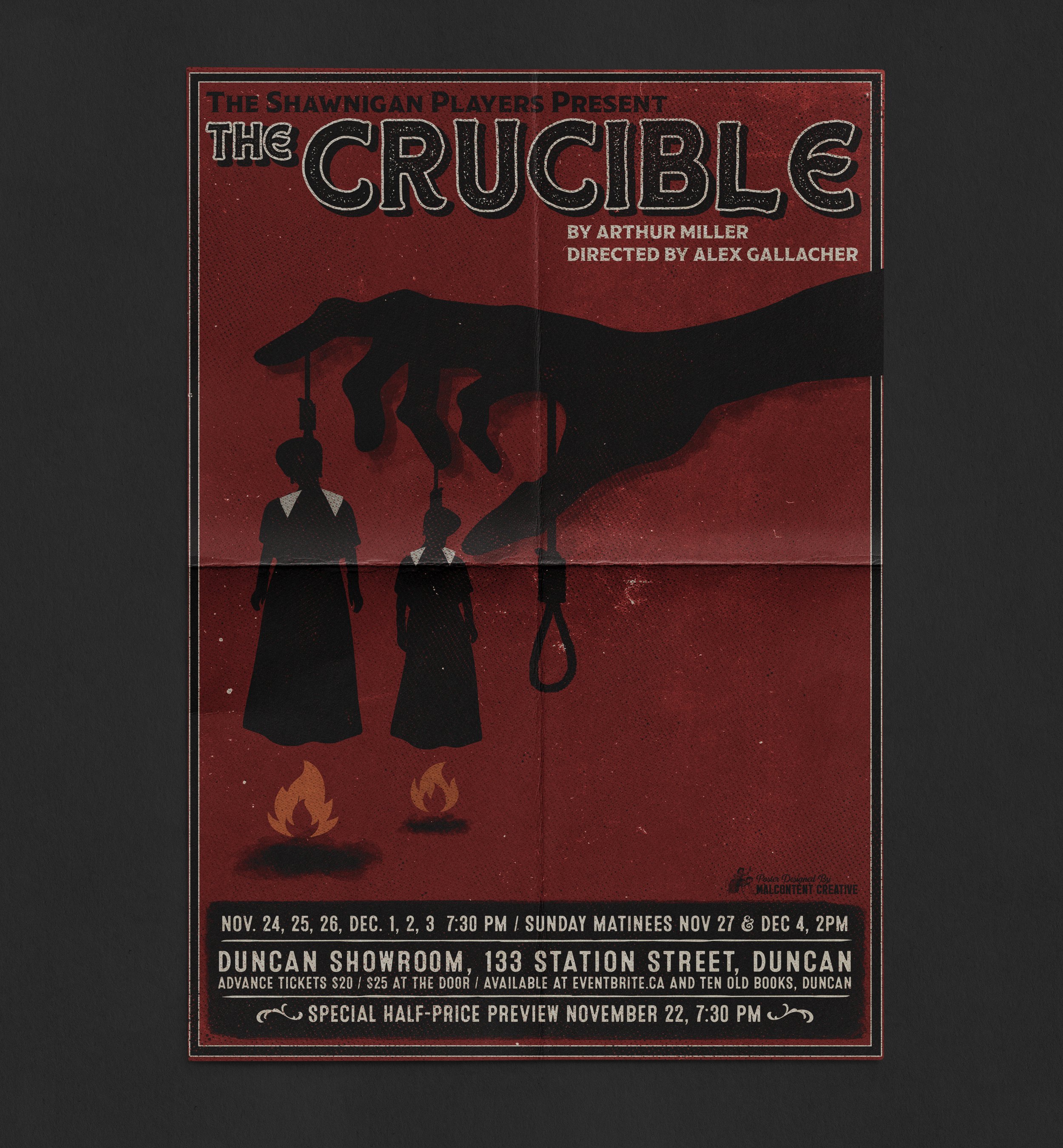
The poster for The Crucible, designed for The Shawnigan Lake Players' production, captures the intense hysteria and tragedy of the witch hunt panic central to the play. The design leans heavily on a stark, bold block print style, emphasizing raw emotion and urgency. The striking use of deep blood reds reflects the violence and paranoia that permeate the play, while the rough, textured print aesthetic echoes the oppressive atmosphere and the chaotic forces at play. The sharp contrasts and angular lines symbolize the manipulation of power and the overwhelming sense of fear that drives the tragic events. The design is visually arresting, drawing the viewer into the play’s dark themes of accusation and betrayal, while its bold aesthetic reinforces the brutal reality of mass hysteria and the devastating consequences of unchecked authority.
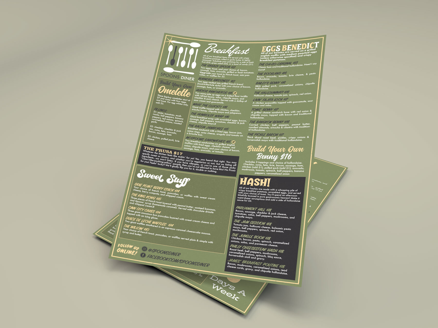
Spoons Diner specialize in homemade comfort food with a contemporary twist. Large, gut-busting portions, over-the-top indulgence, and experimental creations are what you'll find at Spoons Diner!
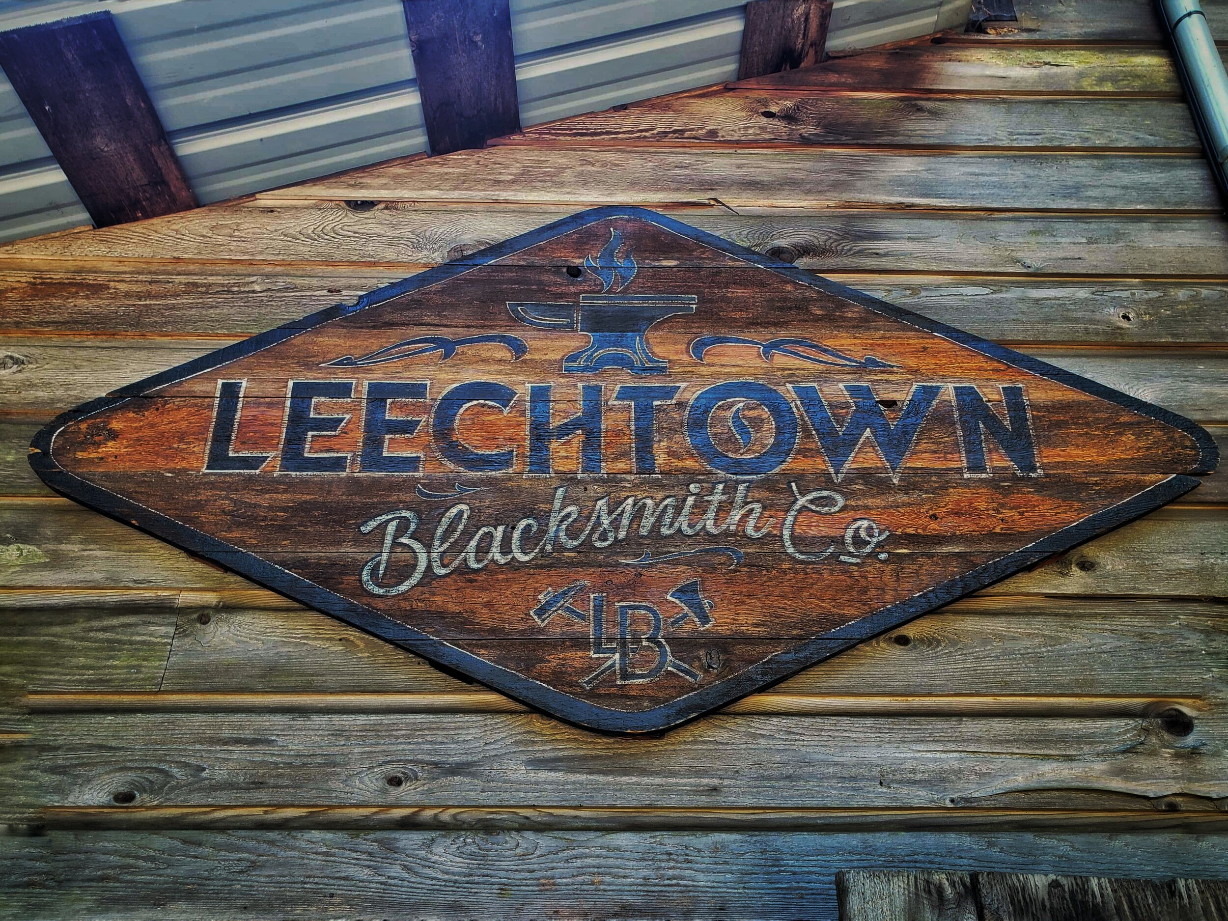
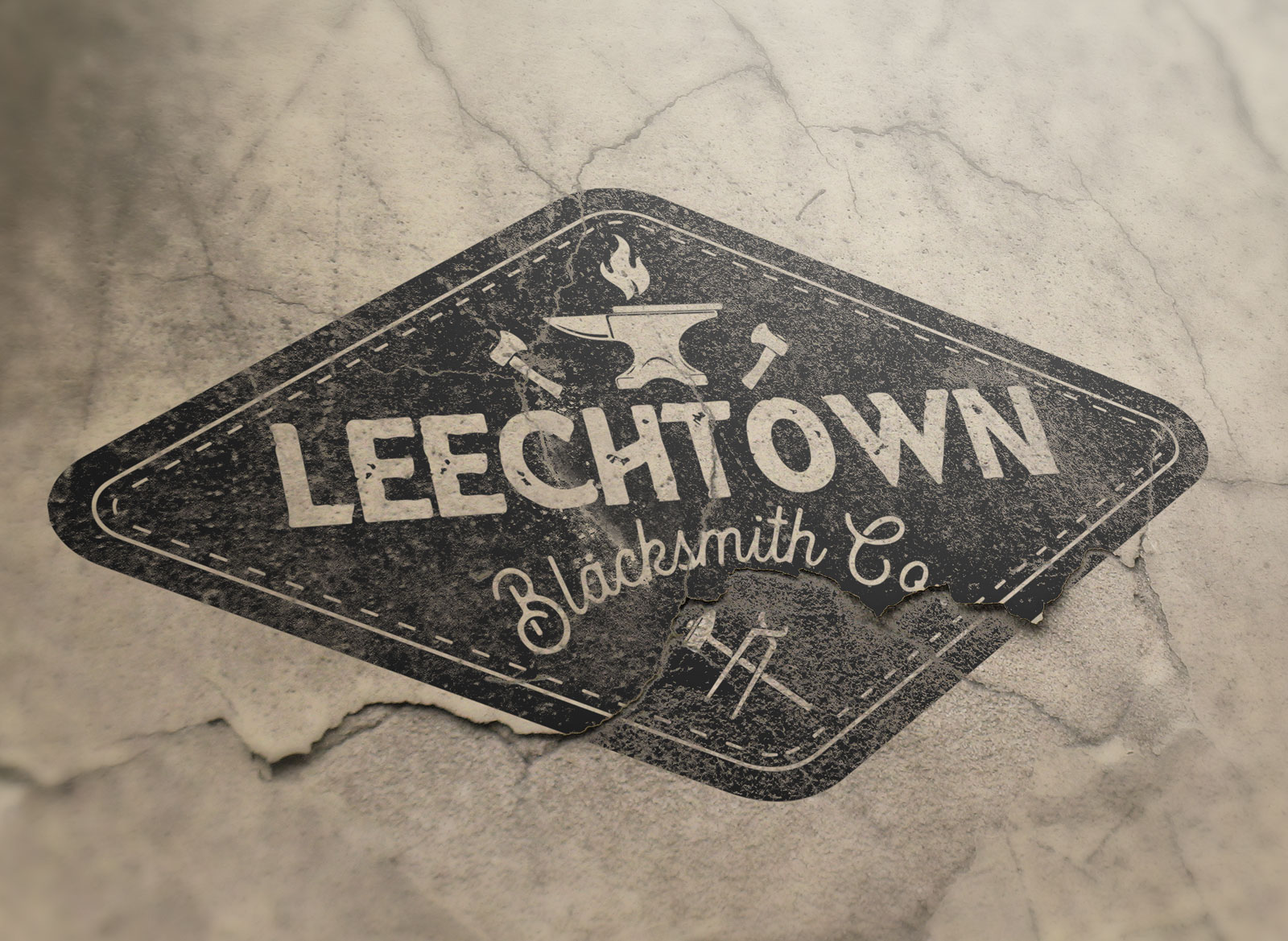
Leechtown Blacksmith Co.'s logo blends traditional craftsmanship with contemporary design. Featuring bold, sharp lines and a striking anvil motif, the logo highlights the company’s dedication to quality metalwork. The earthy color palette reinforces the brand’s historical roots while evoking strength and durability. It communicates both the heritage and resilience of the blacksmithing craft.
Sign Created by Dobell Sign Co.
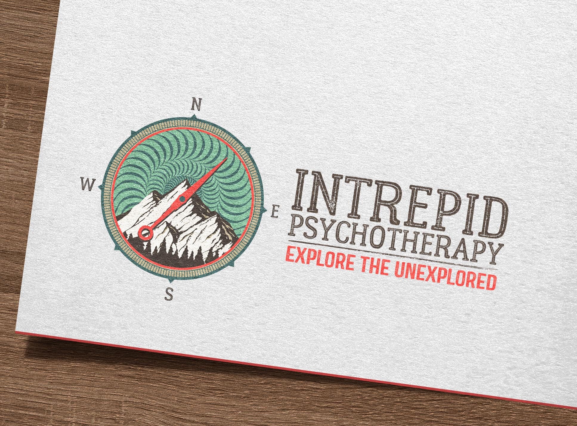
The logo for Intrepid Psychology embodies strength and trust with a modern, clean design. An abstract symbol suggests growth and transformation, while calming colors convey stability and empathy. The sleek typeface reinforces the professional, evidence-based approach of the practice, offering a sense of hope and support to clients seeking psychological services.
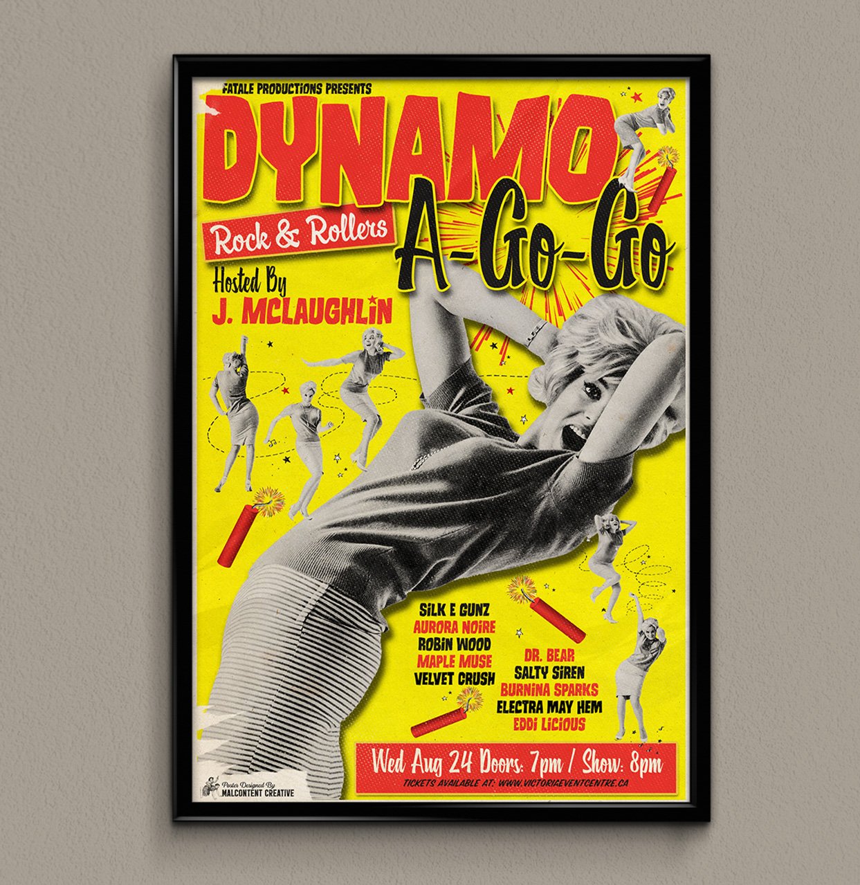
The Dynamo A G-Go poster bursts with energy, using bold typography and vibrant, circus-inspired visuals. The electric colors and fluid shapes emphasize the excitement of the live performance, while the retro elements create an inviting atmosphere that draws the viewer in. The design encapsulates the thrill of the event, reflecting both movement and anticipation.
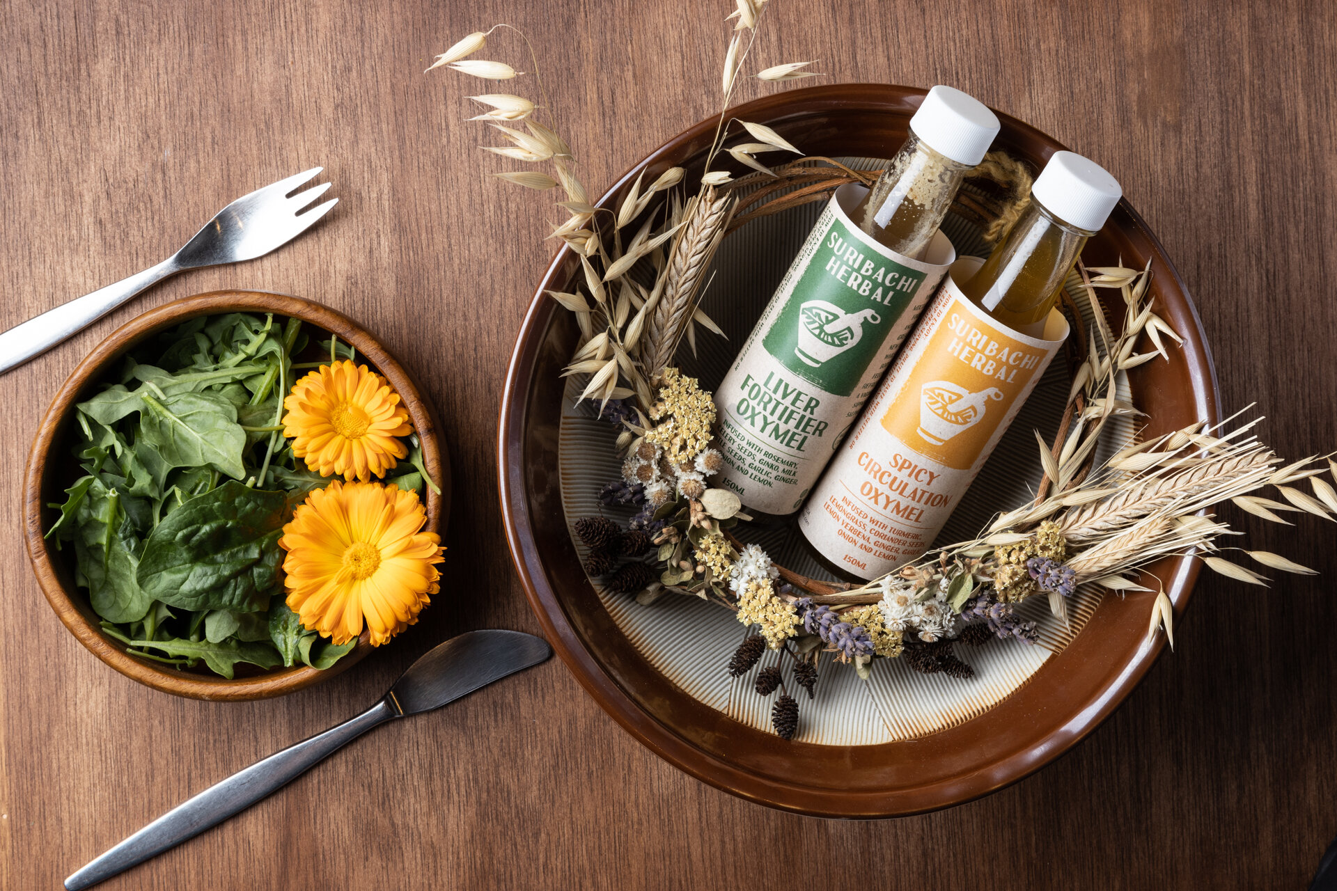
Label Design: Suribachi Herbal, Victoria BC
Old Town Strings’ logo blends classic elegance with a tribute to the past. Featuring vintage-style typography and intricate string motifs, the design evokes a rich heritage of string instruments. The use of gold tones and flowing lines adds warmth and nostalgia, creating a visual identity that appeals to both traditional and modern music lovers.
Web Site
The Salty Broad Productions logo captures creativity and adventure with a vintage-inspired font and coastal-themed graphic elements. Sea-inspired hues of teal and beige connect to the brand’s maritime roots, while the lively design reflects the company’s bold and innovative approach to live entertainment. This logo embodies a spirited, coastal charm, perfect for a production company with a sense of fun.
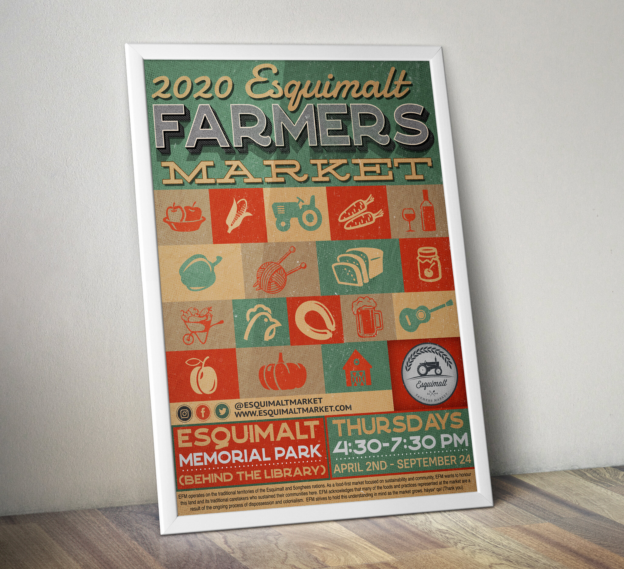
Esquimalt Farmers Market
Esquimalt BC, Canada
Visit Them Here
Logo Design: Fox & Sparrow Esthetics
Mackenzie, British Columbia
Web Site
Logo Design: Red Feather Horticulture
Vancouver Island, Canada
Visit Them Here
Portland Vintage RV & Trailer Park
Portland, Oregon
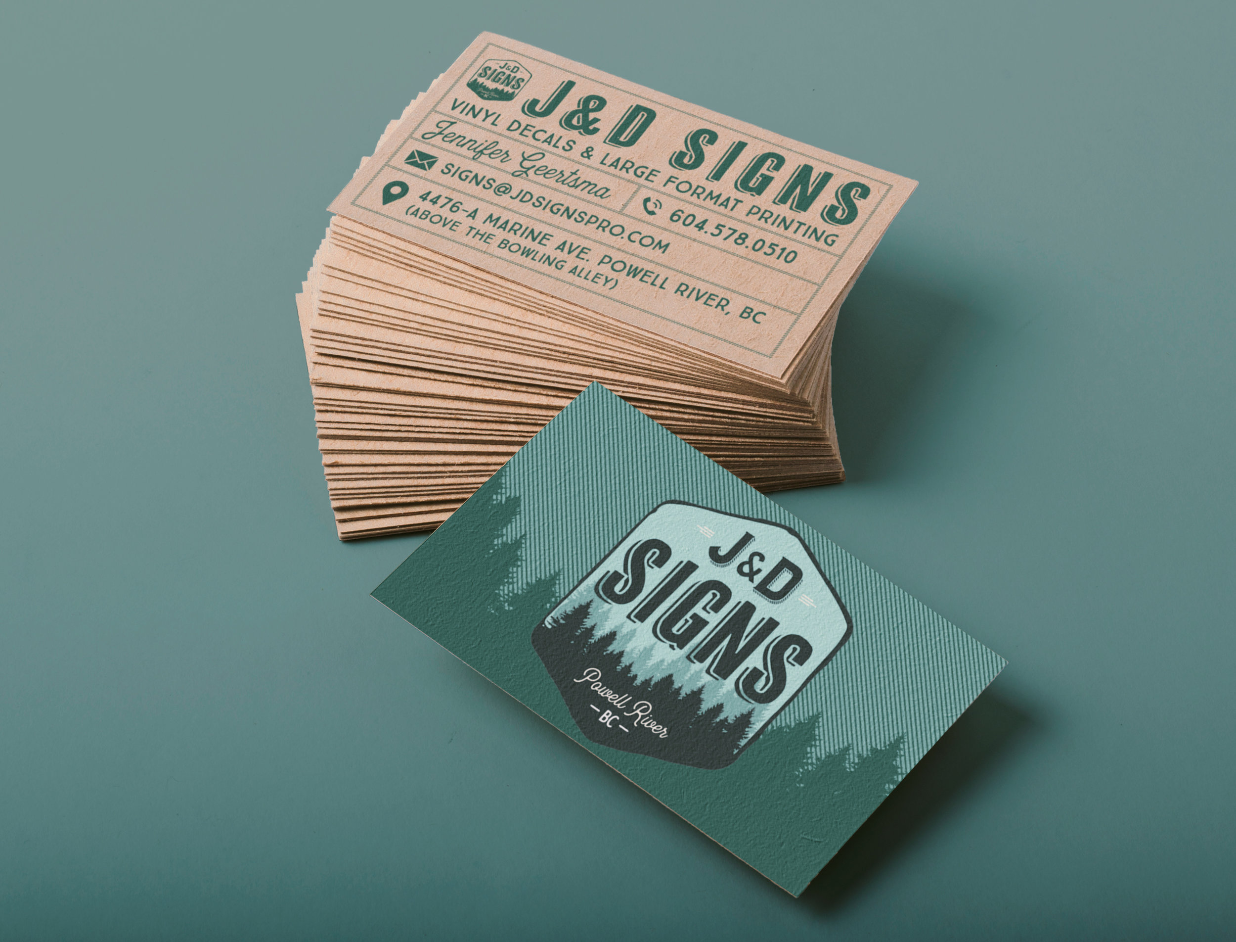
The J&D Signs logo combines earthy green tones and rustic elements, reflecting Powell River’s local charm. The design focuses on strength and community, representing the company’s commitment to craftsmanship. The matching business card mirrors this grounded aesthetic with a minimal, professional layout that emphasizes readability and connection to the town’s natural beauty.
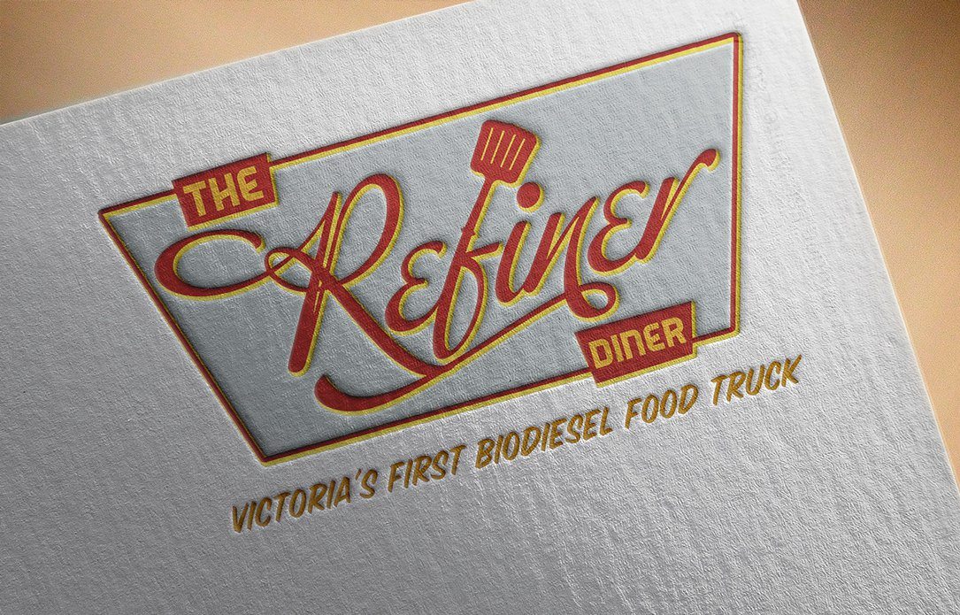
Logo & Signage Design: Refiner Diner Food Truck
Victoria, British Columbia
Victoria’s first bio-diesel food truck
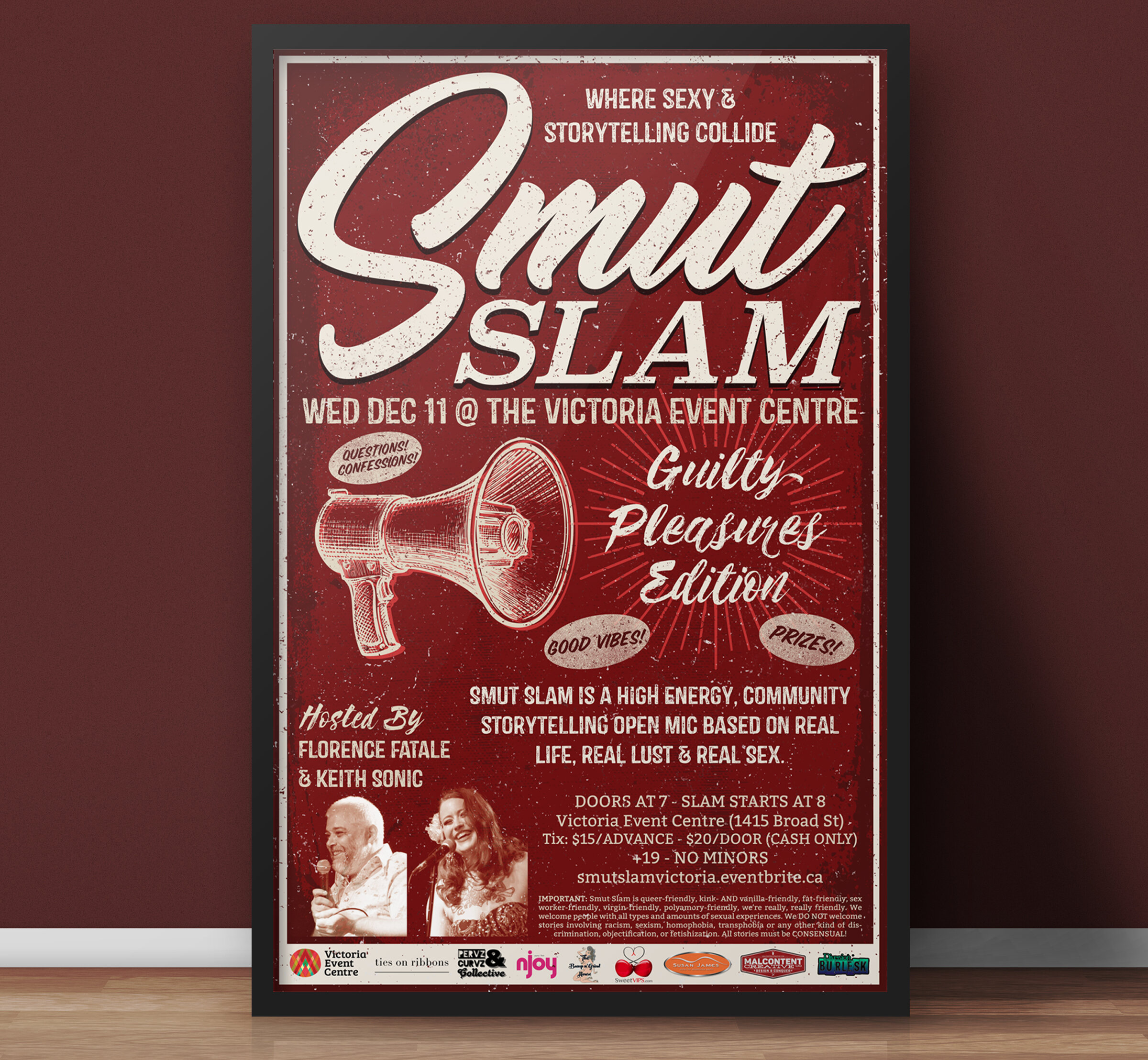
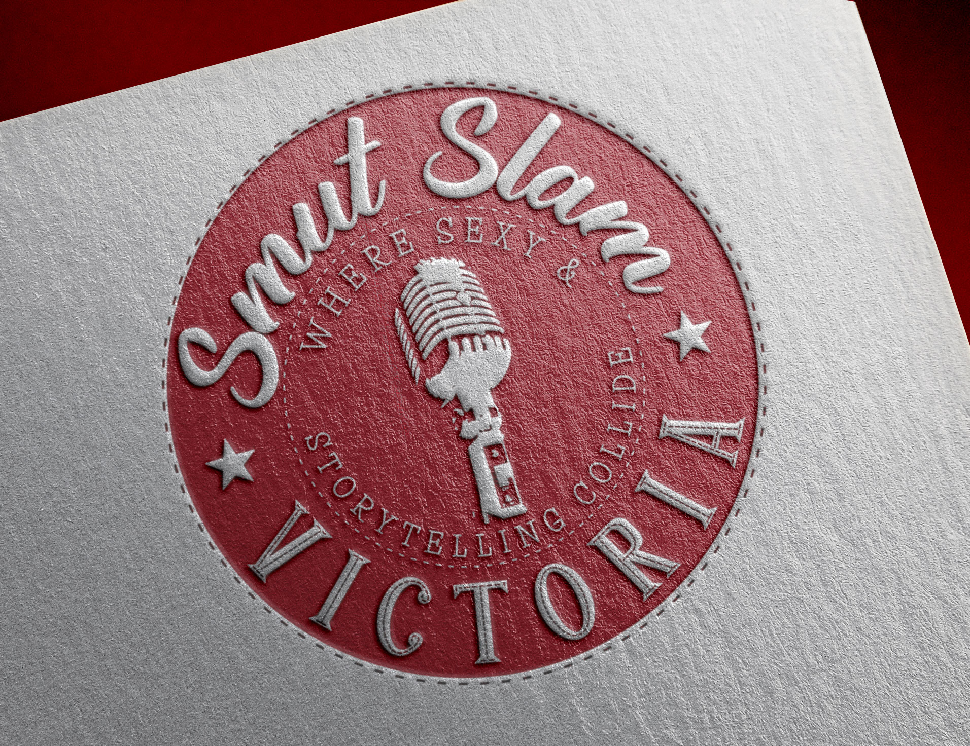
Event Poster: Smut Slam Victoria
Victoria, British Columbia
“Where Sexy & Storytelling Collide”
Visit Them Here
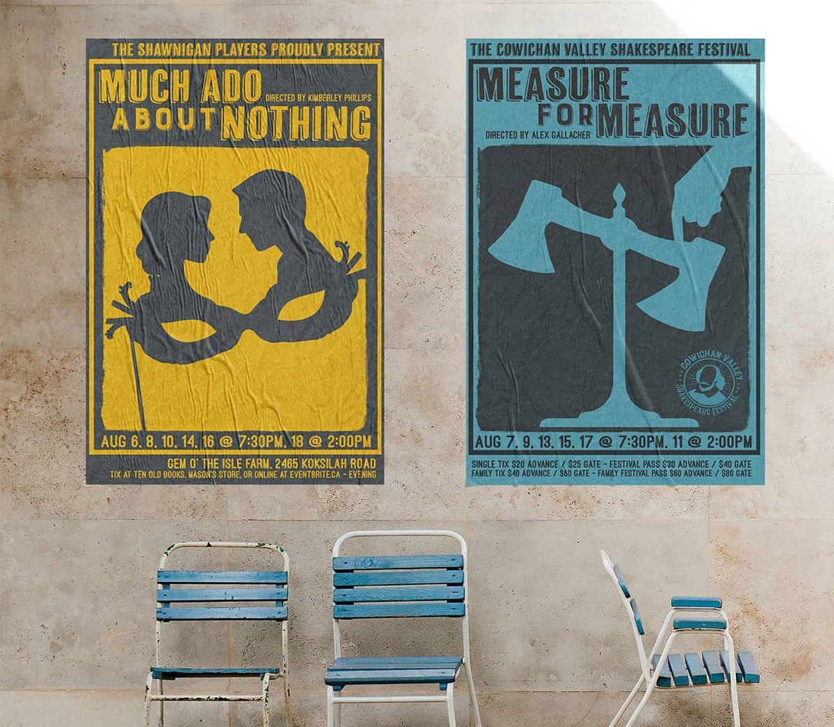
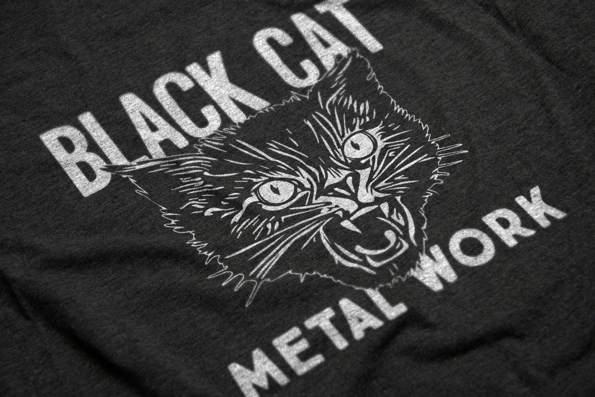
Logo Design: Black Cat Metal Work
Saltspring Island, British Columbia
Web Site
Logo Design: Been There Tapped That
Vancouver Island, British Columbia
Check out there Youtube Page
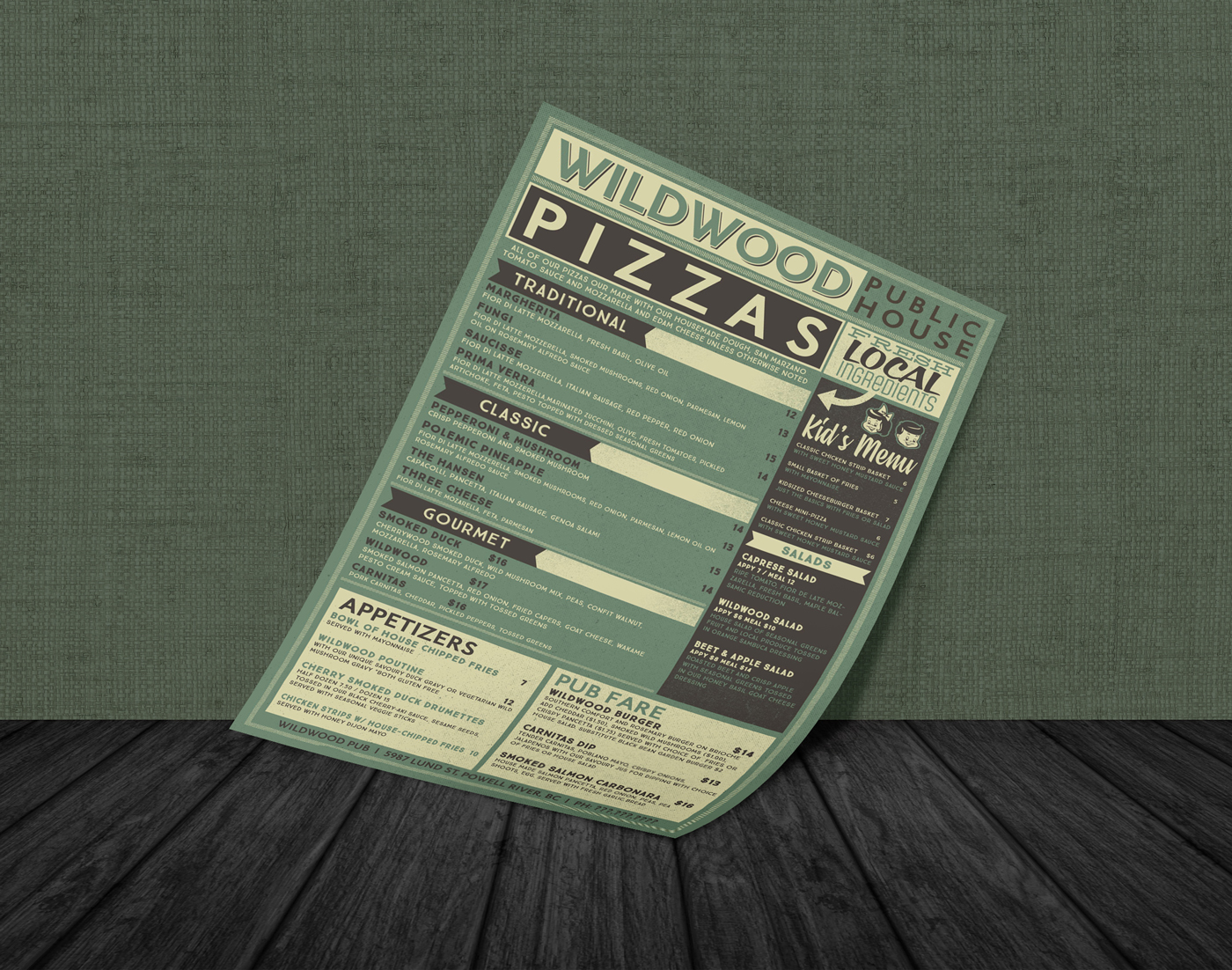
Menu/Branding Design: Wildwood Pub
Powell River, British Columbia
Visit Them Here
Logo Design: Iron Dülas
Sooke, British Columbia
Logo Design: Dock & Dime Reclaimed Wood Co.
Vancouver Island, British Columbia
Dock & Dime creates your dream, wood furnishings. Each piece is skillfully handcrafted by master woodworker, Randall, in his Burnaby shop using reclaimed, "up-cycled" and local materials. Randy takes pride in incorporating the style, sizing, design and colour themes desired by each of Dock & Dime's clients, customizing each piece of beautiful wood furniture for the client's living space.
Web Site
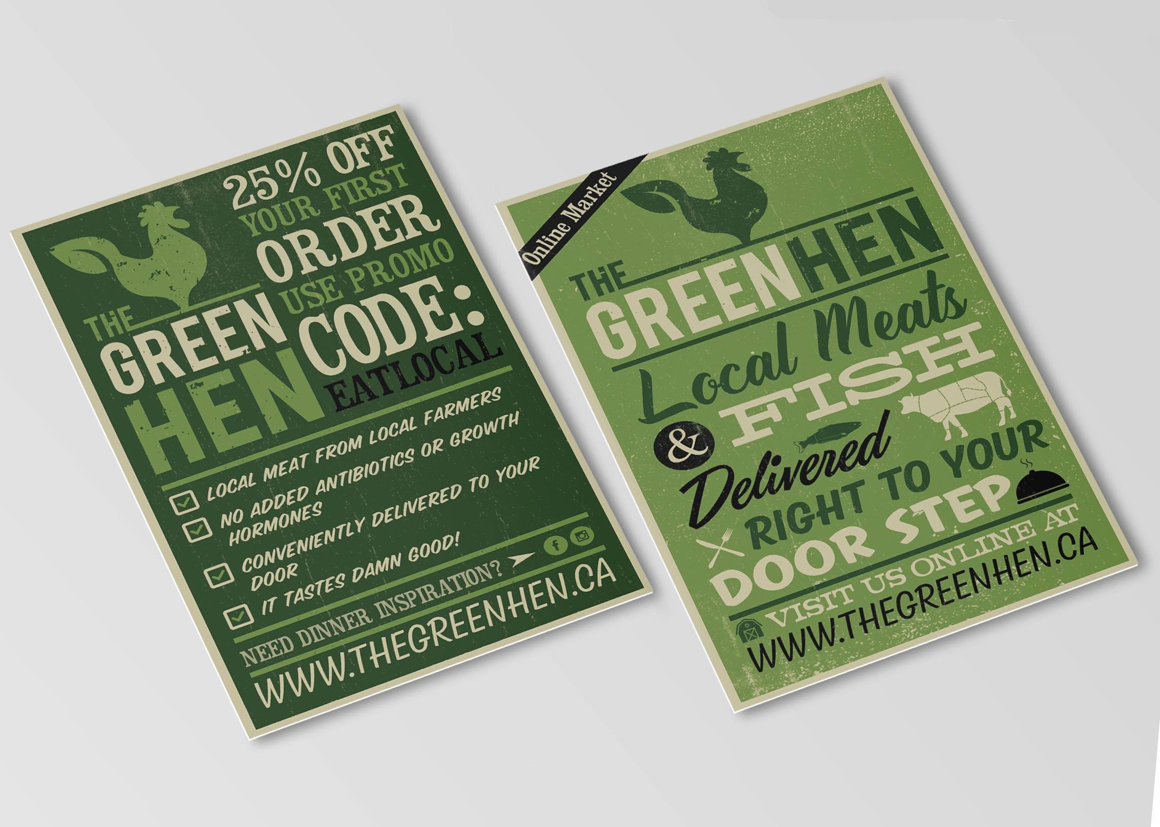
Postcard/Coupon Design: The Green Hen
Victoria, British Columbia
Web Site
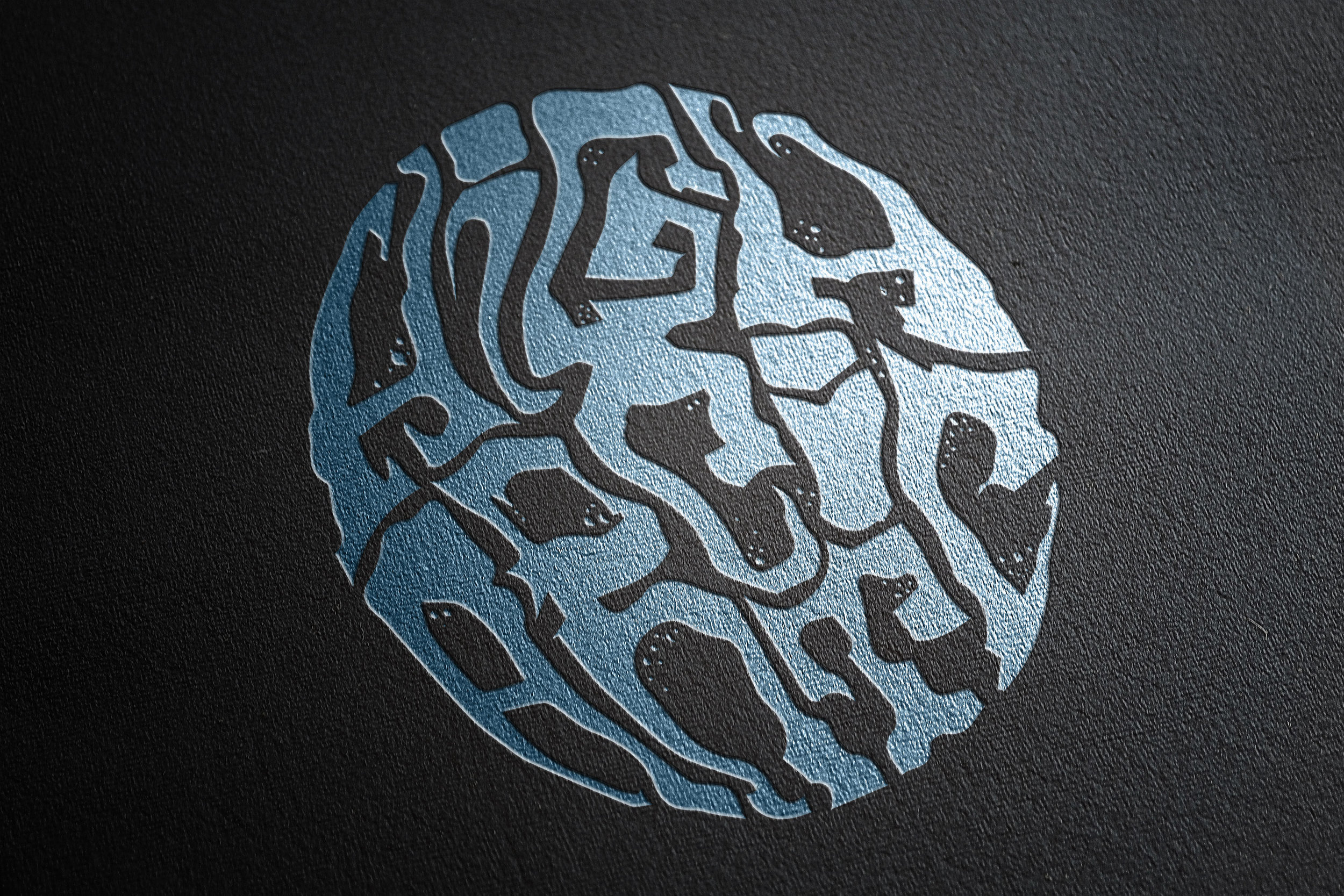
Band Logo Design: High Arctic
Victoria/Sooke, British Columbia
”Heavy Surf Psych Doom that hails from Sooke/Victoria B.C. beneath the veil of Her Majesties critical veil. Smoking riffs and schizoid temperment rest beneath blood curdling wails and coffin laden moans.
Like a backwards Black Sabbath jabbed by Gang of Four.”
Web Site
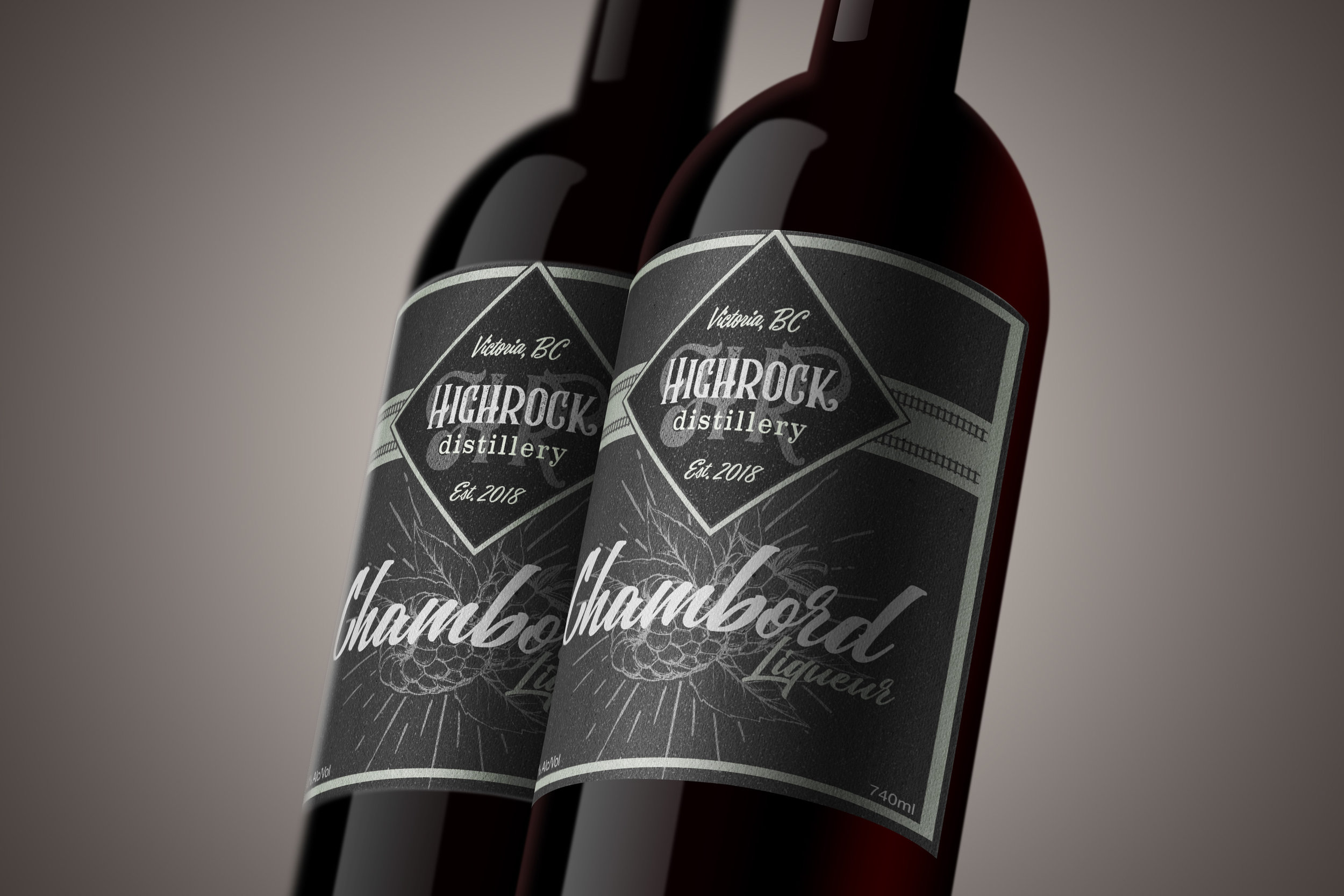
Label & Packaging Design: Highrock Distillery
Chambord Raspberry Liqueur
Vancouver Island.
Est 2018
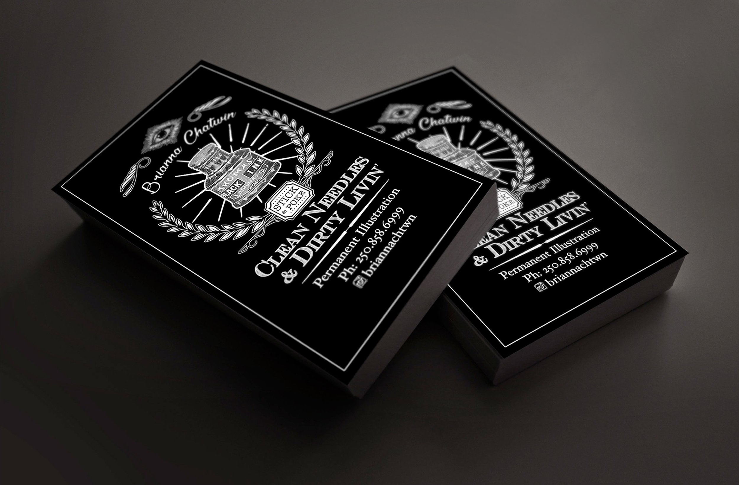
Business Card Design: Brianna Chatwin, Tattoo Artist
”folk art + prison tattoos”
Positioning, navigation, timing, and simulation solutions, from prototype to production
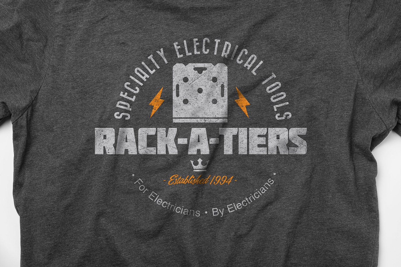
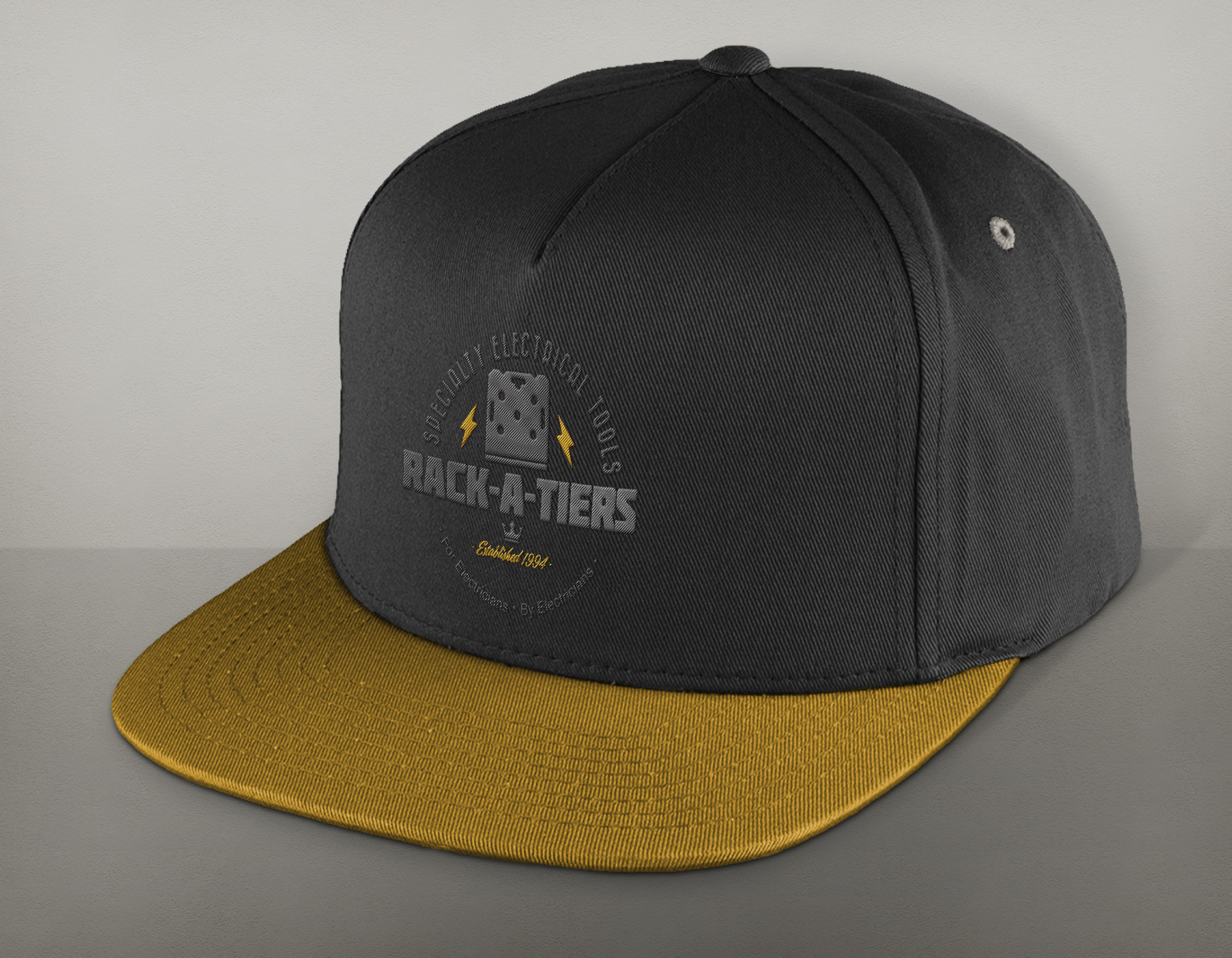
T-Shirt Design: Rack-A-Tiers - Specialty Electrical Tools
Victoria, British Columbia
”Rack-A-Tiers Manufacturing designs and distributes innovative, specialty electrical tools. Rack-A-Tiers Manufacturing offers a portfolio of over 140 quality products, each solving real problems that electricians face every day.”
Web Site
Logo Design: Impromptu Rock Choir
Vancouver, British Columbia
Web SIte
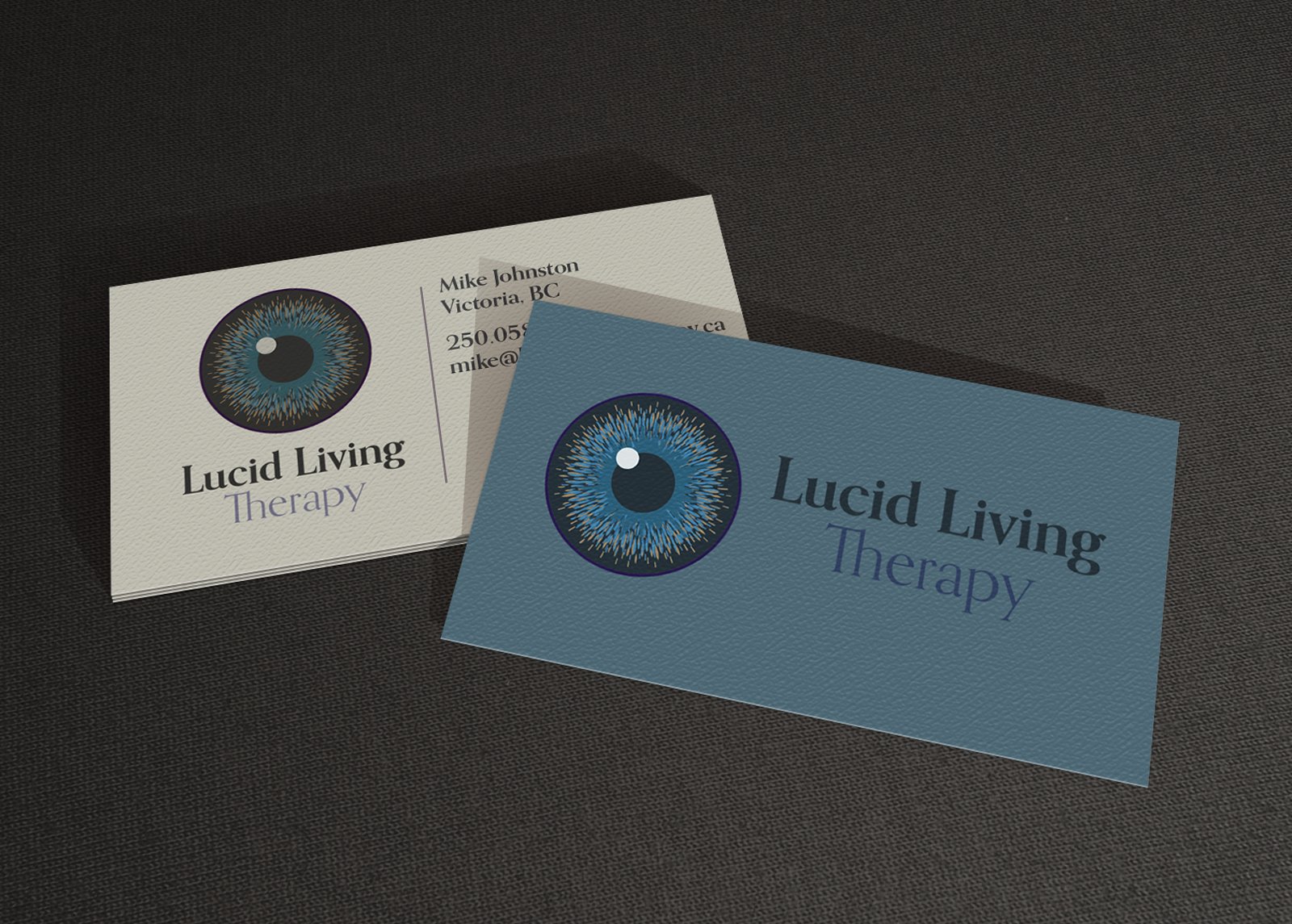
Logo Design: Lucid living Therapy, Victoria BC
Web Site
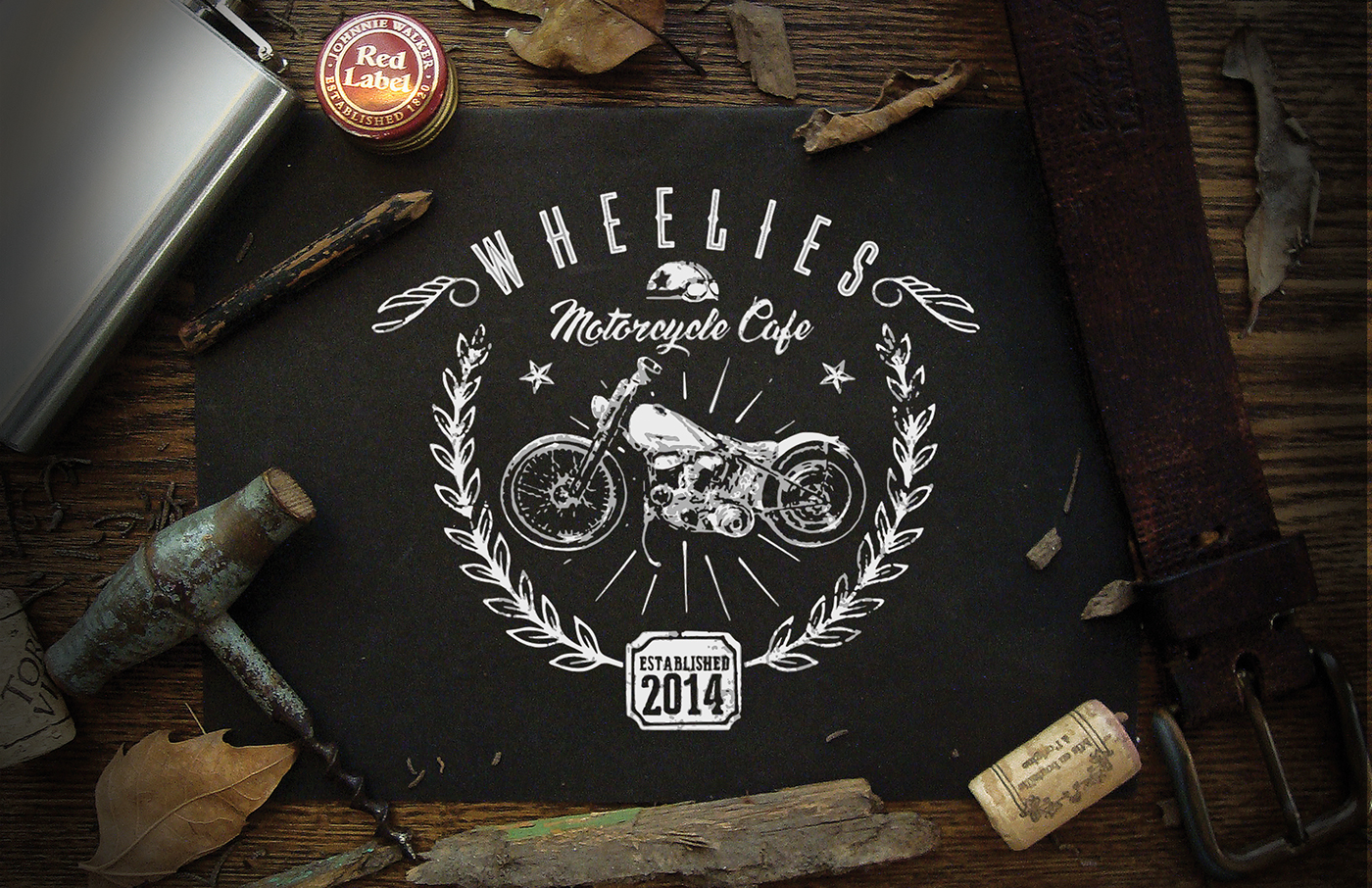
Garment Design: Wheelies Motorcycle Cafe
Victoria, British Columbia
“FINE VINTAGE CUSTOM MOTORCYCLES, GREAT FOOD, COLD BEER, LIVE MUSIC”
Web Site
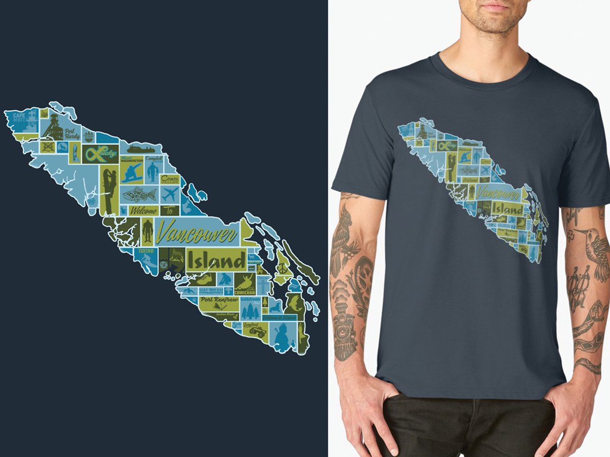
Garment Design: Vancouver Island Pictorial Map
Victoria, British Columbia
Web Site / Redbubble
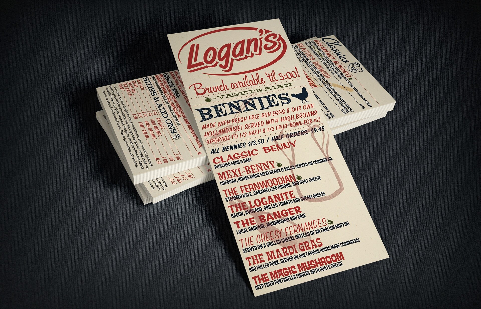
Menu Design: Logan's Pub
Victoria, BC
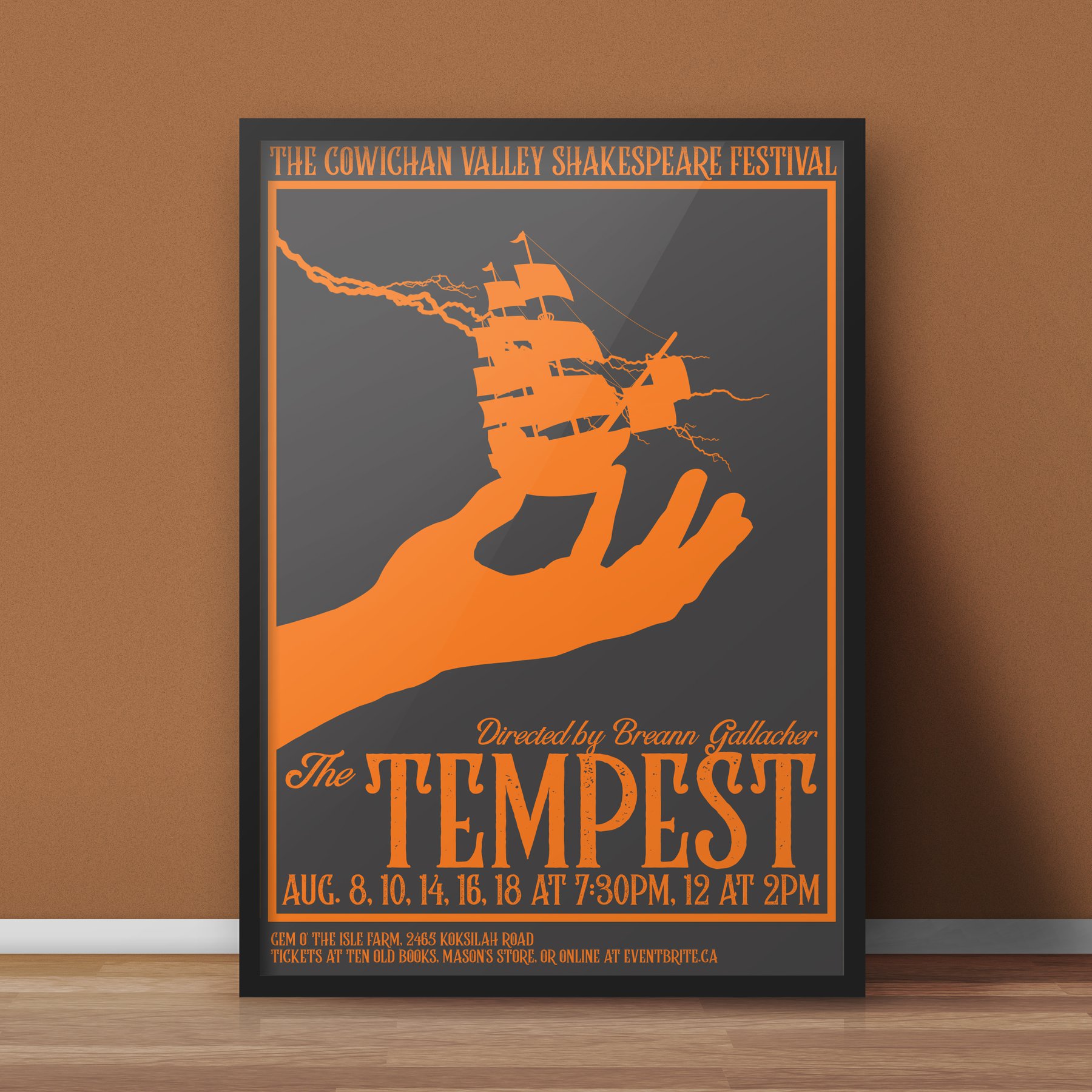
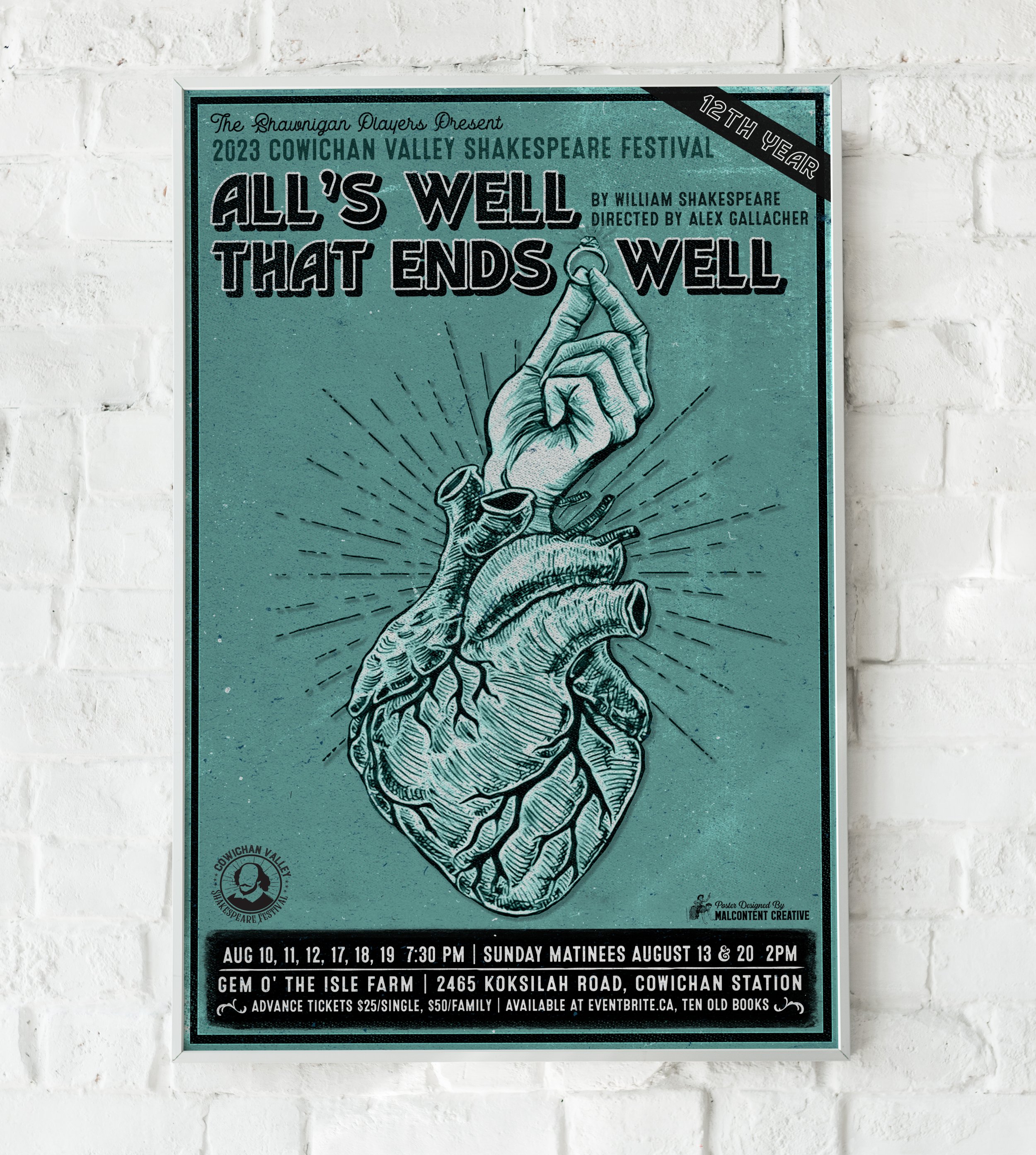
Poster Design: Cowichan Valley Shakespeare Festival: The Tempest
Shawnigan Lake, British Columbia
Web Site
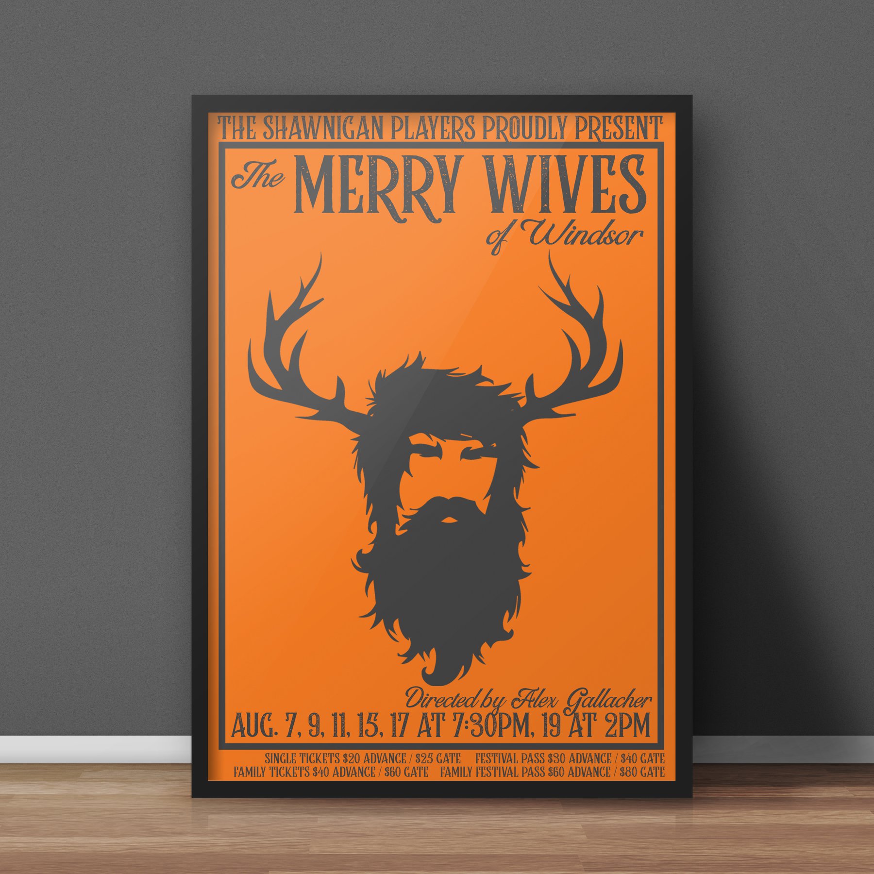
Poster Design: Cowichan Valley Shakespeare Festival:
Merry Wives Of Windsor
Shawnigan Lake, British Columbia
Web Site
Malaspina Dog Grooming Service
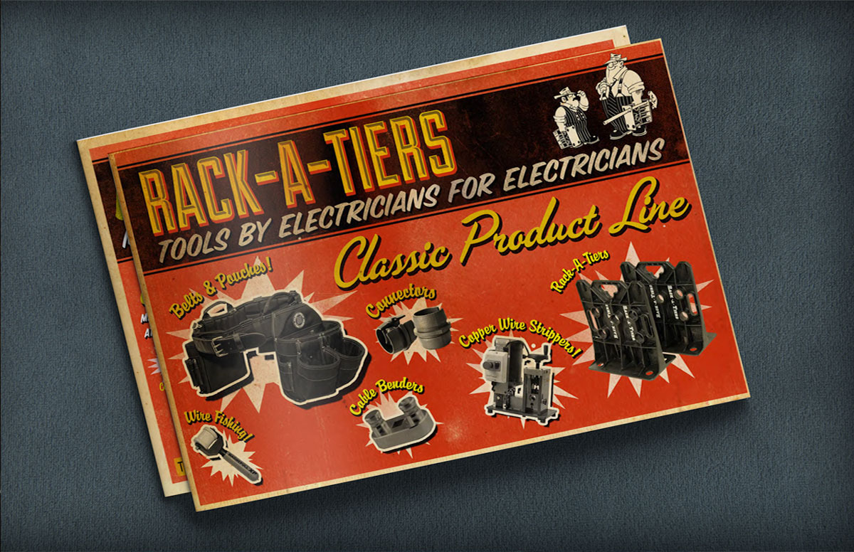
Rack-A-Tiers Manufacturing designs and distributes innovative, specialty electrical tools. Rack-A-Tiers Manufacturing offers a portfolio of over 140 quality products, each solving real problems that electricians face every day.
Web Site
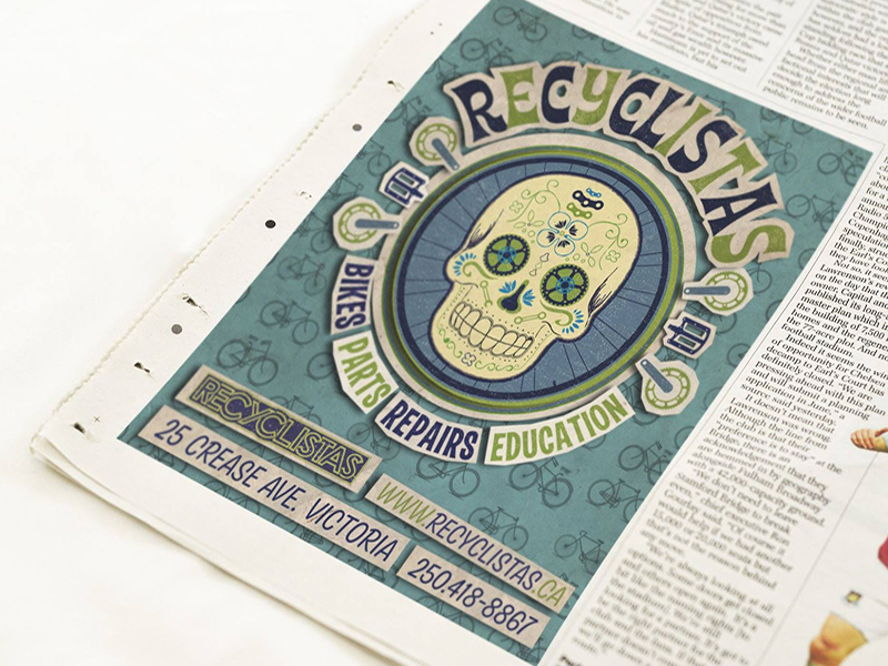
Advertisement Design: Recylista's Bike Shop
Victoria, Britsh Columbia
”Recyclistas is the hub of Greater Victoria’s grassroots cycling community. We are a full-service bicycle repair shop, recycling depot and educational work space. We have a great selection of new and used parts and accessories and used bikes for sale. Since 2003.”
Web Site
Logo Design: Somerset Interactive
Somerset Interactive Web Solutions
Seattle, Washington
Web Site
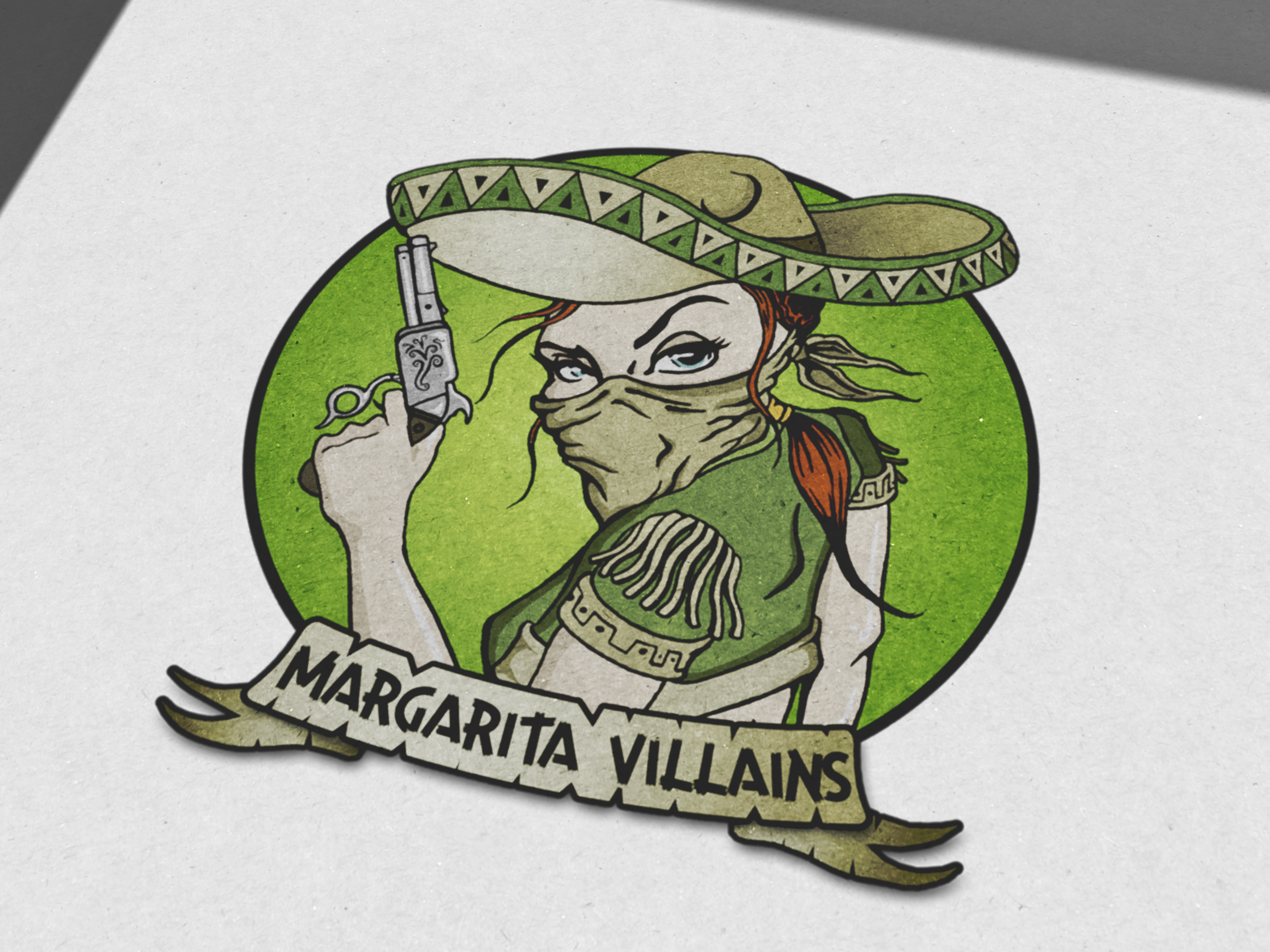
The logo for the Margarita Villains Roller Derby Team exudes energy and attitude. With bold lime greens and reds, the sharp typography and villainous character illustration capture the team’s fun yet competitive spirit. The design reflects the intensity of roller derby while adding a mischievous, playful touch to the team’s identity.
Vancouver Island based instrument and sales & repair
Alma Libre Puma's are a 2003 born soccer team from Victoria, British Columbia. They are aspiring to travel to Europe in 2017 for the Gothia Cup in Sweden.
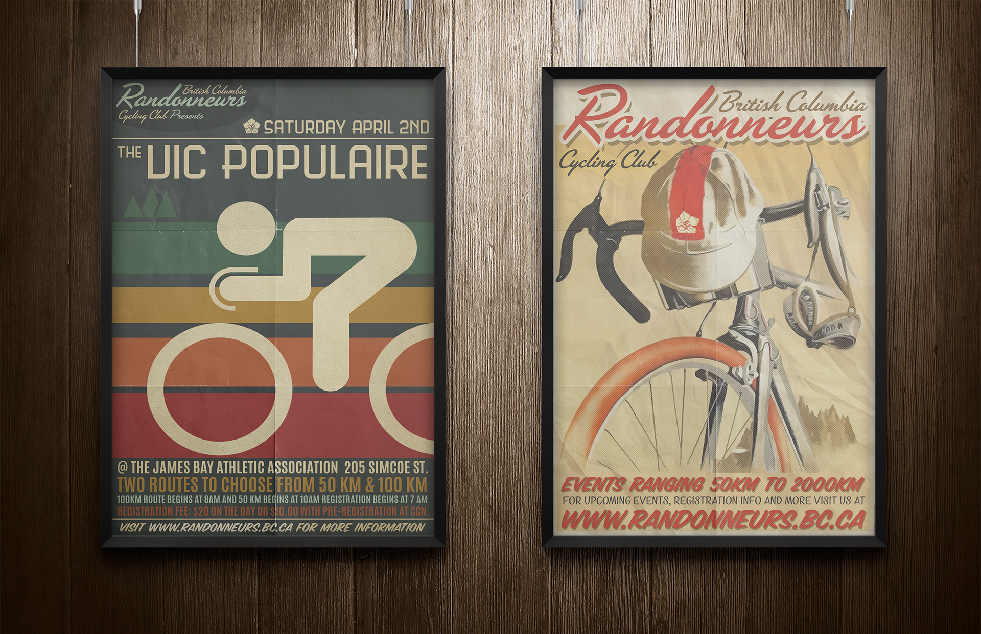
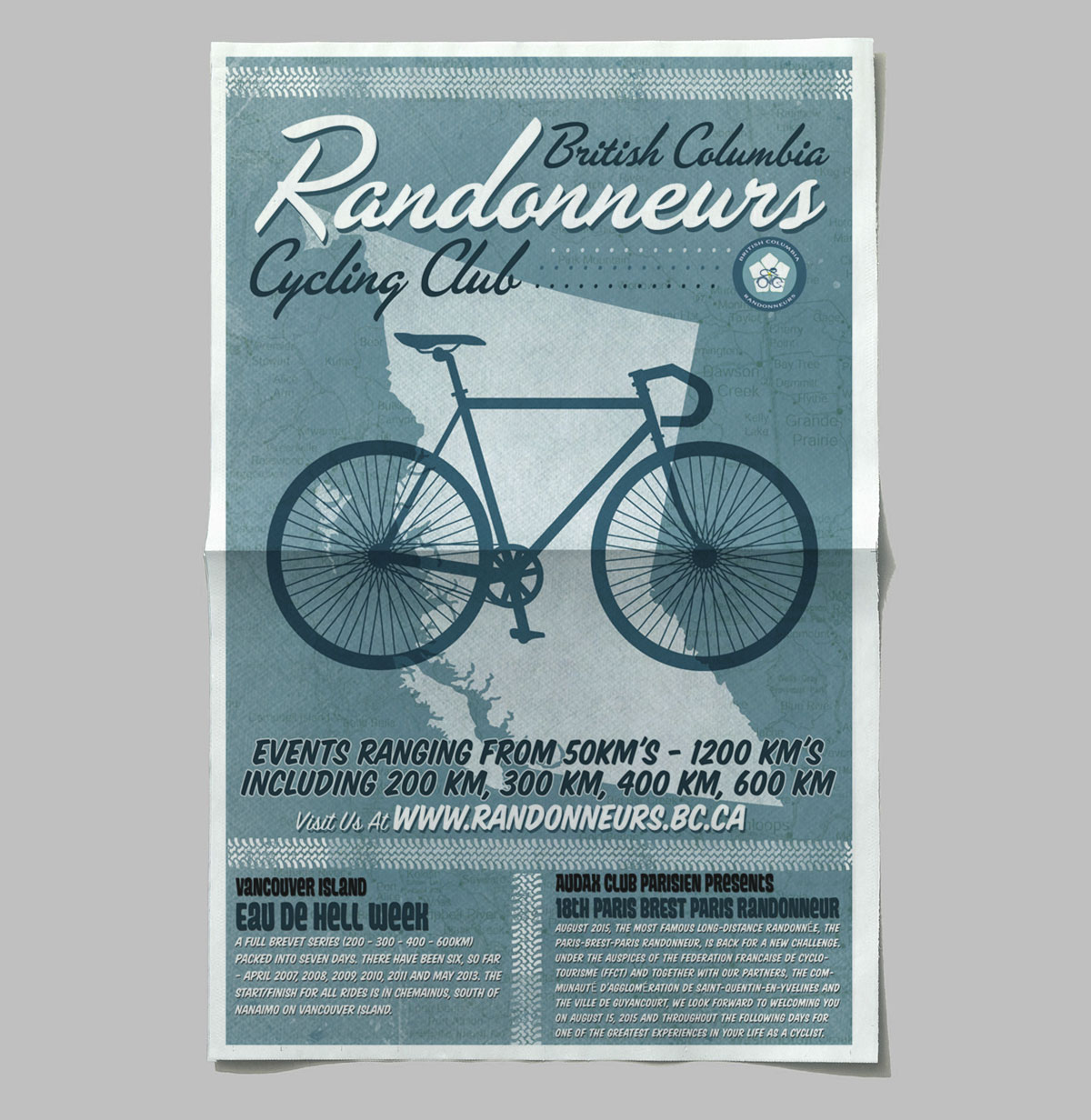
The mandate of BC Randonneurs is to organize rides in accordance to the rules of randonneur cycling as practiced by Audax Club Parisien in France. BC Randonneurs was a founding member in 1983, of Randonneur Mondiaux which organizes brevets 1200 km or longer worldwide.
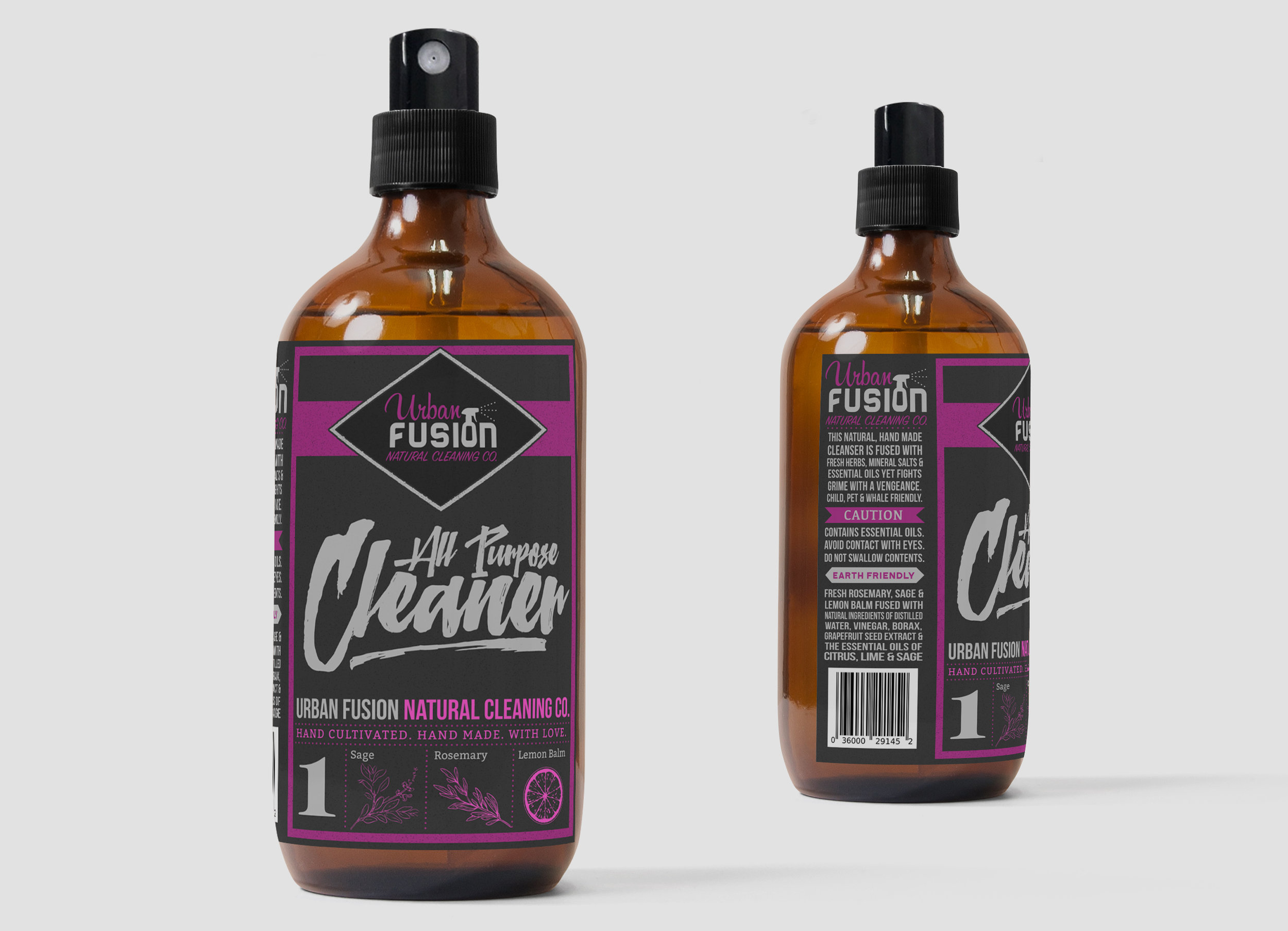
URBAN Fusion is a modern housekeeping collective that uses nature inspired products and aromatherapy practices to dissolve dirt, build up and stagnancy from your space. Our focus is to clean, clear and add peace of mind to your life.

The logo for M.J. Olsen Construction is a clean, minimalist design that highlights the company’s expertise in woodworking and custom craftsmanship. The simplicity of the logo reflects the precision and attention to detail inherent in their work. Subtle elements of measurement, like ruler or caliper-inspired lines, are incorporated to emphasize the technical skill involved in each project. The logo also features a nod to the custom bent wood framing (often referred to as “steam bending” or “curved woodwork”), with smooth, flowing lines that suggest the organic curves of wood being shaped into beautiful, functional structures. This design effectively communicates M.J. Olsen Construction’s dedication to quality, craftsmanship, and the art of woodworking, while maintaining a modern, professional appeal.














The House Heights Hotel neon sign is a striking blend of vintage charm and modern elegance, designed to capture the vibrant energy of Houston, Texas. Featuring a bold yet refined typeface, the sign glows with a warm, inviting ambiance, evoking a sense of classic hospitality with a contemporary twist. Carefully selected neon colors—rich, warm whites with accents of deep amber and electric blue—enhance its visibility while maintaining a timeless, upscale aesthetic.
The design pays homage to historic hotel signage, with a balance of retro curves and clean lines, making it a true landmark both day and night. Mounted on a sleek metal framework, the glowing letters cast a subtle halo effect, creating a dynamic visual presence against the Houston skyline. This neon sign doesn’t just mark a location—it sets the mood, welcoming guests with a nostalgic yet fresh sense of place.
The Fern & Feral Apothecary label is a beautifully crafted design that captures the brand’s wild, botanical essence. Delicate yet organic, it features intricate illustrations of ferns and other natural elements, evoking a sense of untamed beauty and herbal wisdom. The typography blends elegance with a handcrafted feel, reinforcing the brand’s artisanal approach. A rich yet earthy color palette enhances the label’s apothecary aesthetic, making it feel both timeless and modern. Every detail—subtle textures, balanced composition, and refined accents—contributes to an overall design that embodies nature’s wild sophistication and the brand’s commitment to holistic, plant-based remedies.
The Botanical West Farm logo is a beautifully organic design that reflects the farm’s deep connection to nature and its local environment in Victoria, BC. Featuring delicately illustrated native plants, the logo showcases the farm’s dedication to sustainability and regional agriculture. Quails and chickens, thoughtfully integrated into the design, add a charming, rustic touch, symbolizing the farm’s commitment to ethical and natural farming practices. The composition balances elegance and warmth, with an earthy color palette that enhances its authenticity. This logo embodies the essence of Botanical West Farm—local, natural, and thriving with life.
The L.G. Whittaker Instrument Repair business card is a masterclass in understated elegance and craftsmanship. Designed with a black-on-black letterpress technique, the card exudes a sense of sophistication and depth, allowing the tactile impressions to play with light and shadow. The carefully selected typography and subtle detailing create a refined yet bold aesthetic, perfectly aligning with the precision and artistry of instrument repair.
This striking design gained industry recognition in 2019, when it was featured in Creative Bloq Magazine’s “40 Inspiring Examples of Letterpress Business Cards.” Its ability to merge minimalism with luxury made it a standout example of how texture and restraint can elevate a brand’s identity.
The Irvine Electric logo is a bold yet simple design featuring a clean lightbulb icon with subtly integrated "IE" initials, symbolizing power and precision.
The business card maintains this striking simplicity, with a crisp front showcasing the logo and a thoughtfully designed back that includes extra space for customers to write down appointments or notes. Printed on sturdy stock, it’s both professional and practical, ensuring a lasting impression.
The Heights House Hotel brochure marries vintage charm with modern elegance, beautifully illustrating the transformation of this historic hotel. Rich blues, warm neutrals, and gold accents infuse the design with luxury, while high-quality imagery highlights the revamped interiors and lush outdoor areas. The thoughtful use of these elements creates a sense of timeless appeal, tying the hotel’s storied past to its exciting new chapter. Every detail in the brochure—from layout to typography—reflects the hotel’s sophistication, promising guests a stay steeped in both history and comfort.
The infographic tasting wheel designed for Stillhead Distillery maintains strict adherence to the brand's visual standards, ensuring consistency with the brand’s identity. The layout is sleek, clear, and visually appealing, with copper tones that align perfectly with the distillery's rich and warm branding. The use of these elegant copper hues adds a sense of premium quality, while the wheel itself is designed to guide customers through the tasting experience in a way that’s both informative and engaging, reflecting the distillery’s craftsmanship.
The Wildwood Pub signage reflects the transformation of a once-dated dive bar into a vibrant, welcoming pizzeria and pub. The earthy tones and hand-drawn details symbolize both rustic charm and a modern, rejuvenated atmosphere. The design connects the past with the present, creating a sense of community and warmth, making the pub a fresh, inviting local hotspot.
The Hamlet poster for the Shawnigan Lake Players is a bold reimagining of Shakespeare’s tragedy, blending modern urban aesthetics with the play’s iconic skull imagery for a striking, unforgettable design.
The Process:
I started with the core visual—the skull, a universally recognized symbol of mortality and Hamlet’s existential struggle. Instead of a traditional, classical approach, I infused it with a raw, urban edge, incorporating elements like gritty textures, bold graphic contrasts, and dynamic negative space to give the poster a contemporary feel.
The typography follows suit, mixing sharp, modern sans-serifs with distressed or hand-drawn letterforms, echoing street art or punk rock posters. The color contrast is high-impact, possibly stark black and white with bold, dramatic red accents, drawing immediate attention while reinforcing the themes of blood, fate, and tragedy.
Layered details—perhaps subtle halftones, ink splatters, or fragmented imagery—add depth, making the design feel visceral and cinematic. The final composition ensures that, whether viewed from afar or up close, the poster is as gripping as the play itself—bold, moody, and unforgettable.
The Stoney Peak Restorations logo cleverly incorporates vintage BMW motorcycle elements. Using the iconic old-school BMW logo and an illustration of a classic motorcycle, it highlights the company’s focus on restoring vintage BMW bikes. The design combines the essence of precision engineering with the timeless appeal of these iconic machines, showcasing their expertise in motorcycle restoration. The logo evokes a sense of nostalgia while symbolizing craftsmanship and dedication to preserving the legacy of vintage BMW motorcycles
Logo Design & Branding: Logic League Consulting Co.
’Reimagining Emergency Management in British Columbia’
Vancouver Island, British Columbia
Web Site
The Chris Hopper Tattoos business card is a perfect blend of old-world craftsmanship and rugged authenticity, designed to reflect both the artistry and permanence of tattooing. At its core, an antique ink bottle illustration serves as a striking visual frame for the card’s key information—its intricate detailing giving a vintage apothecary feel, while also subtly referencing the tools of the trade.
Printed on rugged, natural paper stock, the card has a rich, tactile quality that enhances its handcrafted appeal. The slightly textured surface, combined with an off-set printed look, gives the design an intentionally imperfect, aged aesthetic—evoking the feel of old letterpress prints or vintage shop signage. The result is a business card that doesn’t just share contact details but tells a story of artistry, tradition, and timeless craftsmanship—just like a great tattoo.The Chris Hopper Tattoos business card is a perfect blend of old-world craftsmanship and rugged authenticity, designed to reflect both the artistry and permanence of tattooing. At its core, an antique ink bottle illustration serves as a striking visual frame for the card’s key information—its intricate detailing giving a vintage apothecary feel, while also subtly referencing the tools of the trade.
Printed on rugged, natural paper stock, the card has a rich, tactile quality that enhances its handcrafted appeal. The slightly textured surface, combined with an off-set printed look, gives the design an intentionally imperfect, aged aesthetic—evoking the feel of old letterpress prints or vintage shop signage. The result is a business card that doesn’t just share contact details but tells a story of artistry, tradition, and timeless craftsmanship—just like a great tattoo.
The Visionary Glass business cards are a striking fusion of design and material, embodying the company’s expertise in glass and windows through an innovative semi-opaque finish. The translucent quality of the cards creates an immediate visual and tactile connection to the brand, mimicking the way light interacts with frosted or architectural glass.
The logo design is equally refined, featuring subtle geometric shapes that subtly reference the structure of panes and frames. These elements are strategically incorporated, allowing the interplay of transparency and solid areas to reinforce the brand’s identity without overwhelming the minimalist aesthetic. The balance of crisp typography, negative space, and the layered depth of the material ensures that the card is not only visually memorable but also a perfect physical representation of Visionary Glass’s craftsmanship and innovation.
The QB Spa logo communicates luxury and tranquility through its minimalist approach. The soft, custom serif typeface paired with muted blues and golds evokes a sense of calm and sophistication, ideal for a wellness space. The clean lines and serene color palette create an inviting and timeless identity for the spa, positioning it as a premium destination for rejuvenation.
Packaging Design: Idle Hands Merlot
Vancouver Island, British Columbia
Package Design: Tree Crusher Cannabis
Mackenzie, BC
The Sandwith Mechanical logo merges vintage script with industrial design elements, reminiscent of the golden age of mechanics. The light blue and retro typography evoke nostalgia while maintaining a fresh, professional look. The flowing script and clean mechanical details make the logo approachable yet dependable, representing the company’s commitment to quality craftsmanship and innovation.
The Urban Fusion Cleaning logo combines classic sign painter-style typography with a modern twist, creating a blend of tradition and freshness that speaks to the heart of the business. The bold, vintage-inspired type lends a sense of reliability and craftsmanship, while the playful integration of a spray bottle into the 'o' in “fusion” creatively ties in the cleaning aspect of the business.
The use of pastel colors—soft blues, greens, and pinks—adds a clean, fresh feel that perfectly reflects the brand’s focus on providing a sparkling, welcoming service. The overall design strikes a balance between nostalgic charm and modern cleanliness, creating a logo that feels both approachable and professional while reinforcing the brand’s commitment to quality cleaning with a touch of personality.
For Spoons Diner, the menu design is a vibrant homage to the diner’s retro roots, blended with modern sensibilities. The playful mix of green and yellow hues immediately catches the eye, evoking warmth and comfort, while the whimsical typography and illustrations enhance the nostalgic, friendly atmosphere. Designed for functionality as well as flair, the layout leads customers through the offerings with ease. The color palette and energetic composition communicate the diner’s fun-loving spirit, making this menu both an experience and a reflection of the inviting space.
The Keating Pizza menu is a bold and visually striking design that perfectly balances vintage charm with modern energy. The layout is dynamic and engaging, guiding the eye effortlessly through the offerings with a mix of strong typography, playful arrangements, and well-placed accents. The bold orange, black, and white color scheme creates a high-contrast, eye-popping look that feels both classic and fresh. Vintage-inspired typefaces and subtle distressed textures give the menu a nostalgic, old-school pizzeria feel while maintaining a crisp, contemporary appeal. Every element—from the carefully chosen fonts to the structured yet lively layout—makes this menu as appetizing as the pizza itself.
The Swing Low Strings logo and business card embody a perfect blend of handcrafted artistry and musical craftsmanship. The hand-drawn type gives the design a personal, artisanal feel, while the kinetic flourishes surrounding the text evoke the motion and precision of instrument repair. The flowing curves and intricate details within the design not only reflect the care and expertise behind the service but also have an almost block print aesthetic, lending a timeless, vintage quality to the brand.
The business card complements this design with a clean, simple layout, allowing the bold logo to take center stage. The text is clear and easy to read, while the organic, dynamic flourishes suggest movement and life, like the strings of an instrument being carefully tuned. The overall effect is both artistic and functional, embodying the essence of Swing Low Strings as a place where craftsmanship and creativity meet.
The "Halloween A Go-Go" poster is a dazzling fusion of vintage tease and classic spook show aesthetics, designed to electrify the senses and capture the playful allure of burlesque. Drenched in bold red and deep black, the color palette evokes the drama of old-school horror flyers while maintaining the sultry charm of mid-century go-go and pin-up culture.
The eye-catching imagery is a hypnotic mix of vintage-inspired typography, exaggerated motion lines, and striking silhouettes—channeling the energy of 1960s grindhouse posters. Bold, theatrical lettering and distressed textures enhance the retro appeal, while strategically placed eerie elements—a winking skull, swirling smoke, or a devilish femme fatale—add a touch of spooky seduction.
This poster doesn’t just announce a show—it commands attention, tempts curiosity, and sets the stage for a night of thrills, chills, and tantalizing tease.
The poster for The Crucible, designed for The Shawnigan Lake Players' production, captures the intense hysteria and tragedy of the witch hunt panic central to the play. The design leans heavily on a stark, bold block print style, emphasizing raw emotion and urgency. The striking use of deep blood reds reflects the violence and paranoia that permeate the play, while the rough, textured print aesthetic echoes the oppressive atmosphere and the chaotic forces at play. The sharp contrasts and angular lines symbolize the manipulation of power and the overwhelming sense of fear that drives the tragic events. The design is visually arresting, drawing the viewer into the play’s dark themes of accusation and betrayal, while its bold aesthetic reinforces the brutal reality of mass hysteria and the devastating consequences of unchecked authority.
Spoons Diner specialize in homemade comfort food with a contemporary twist. Large, gut-busting portions, over-the-top indulgence, and experimental creations are what you'll find at Spoons Diner!
Leechtown Blacksmith Co.'s logo blends traditional craftsmanship with contemporary design. Featuring bold, sharp lines and a striking anvil motif, the logo highlights the company’s dedication to quality metalwork. The earthy color palette reinforces the brand’s historical roots while evoking strength and durability. It communicates both the heritage and resilience of the blacksmithing craft.
Sign Created by Dobell Sign Co.
The logo for Intrepid Psychology embodies strength and trust with a modern, clean design. An abstract symbol suggests growth and transformation, while calming colors convey stability and empathy. The sleek typeface reinforces the professional, evidence-based approach of the practice, offering a sense of hope and support to clients seeking psychological services.
The Dynamo A G-Go poster bursts with energy, using bold typography and vibrant, circus-inspired visuals. The electric colors and fluid shapes emphasize the excitement of the live performance, while the retro elements create an inviting atmosphere that draws the viewer in. The design encapsulates the thrill of the event, reflecting both movement and anticipation.
Label Design: Suribachi Herbal, Victoria BC
Old Town Strings’ logo blends classic elegance with a tribute to the past. Featuring vintage-style typography and intricate string motifs, the design evokes a rich heritage of string instruments. The use of gold tones and flowing lines adds warmth and nostalgia, creating a visual identity that appeals to both traditional and modern music lovers.
Web Site
The Salty Broad Productions logo captures creativity and adventure with a vintage-inspired font and coastal-themed graphic elements. Sea-inspired hues of teal and beige connect to the brand’s maritime roots, while the lively design reflects the company’s bold and innovative approach to live entertainment. This logo embodies a spirited, coastal charm, perfect for a production company with a sense of fun.
Esquimalt Farmers Market
Esquimalt BC, Canada
Visit Them Here
Logo Design: Fox & Sparrow Esthetics
Mackenzie, British Columbia
Web Site
Logo Design: Red Feather Horticulture
Vancouver Island, Canada
Visit Them Here
Portland Vintage RV & Trailer Park
Portland, Oregon
Logo Design: Leechtown Blacksmith Co.
Sooke, British Columbia
Web Site
The J&D Signs logo combines earthy green tones and rustic elements, reflecting Powell River’s local charm. The design focuses on strength and community, representing the company’s commitment to craftsmanship. The matching business card mirrors this grounded aesthetic with a minimal, professional layout that emphasizes readability and connection to the town’s natural beauty.
Logo & Signage Design: Refiner Diner Food Truck
Victoria, British Columbia
Victoria’s first bio-diesel food truck
Event Poster: Smut Slam Victoria
Victoria, British Columbia
“Where Sexy & Storytelling Collide”
Visit Them Here
Logo Design: Black Cat Metal Work
Saltspring Island, British Columbia
Web Site
Logo Design: Been There Tapped That
Vancouver Island, British Columbia
Check out there Youtube Page
Menu/Branding Design: Wildwood Pub
Powell River, British Columbia
Visit Them Here
Logo Design: Iron Dülas
Sooke, British Columbia
Logo Design: Dock & Dime Reclaimed Wood Co.
Vancouver Island, British Columbia
Dock & Dime creates your dream, wood furnishings. Each piece is skillfully handcrafted by master woodworker, Randall, in his Burnaby shop using reclaimed, "up-cycled" and local materials. Randy takes pride in incorporating the style, sizing, design and colour themes desired by each of Dock & Dime's clients, customizing each piece of beautiful wood furniture for the client's living space.
Web Site
Smut Slam Victoria:
Where Sexy & Storytelling Collide
Visit Them Here
Postcard/Coupon Design: The Green Hen
Victoria, British Columbia
Web Site
Band Logo Design: High Arctic
Victoria/Sooke, British Columbia
”Heavy Surf Psych Doom that hails from Sooke/Victoria B.C. beneath the veil of Her Majesties critical veil. Smoking riffs and schizoid temperment rest beneath blood curdling wails and coffin laden moans.
Like a backwards Black Sabbath jabbed by Gang of Four.”
Web Site
Label & Packaging Design: Highrock Distillery
Chambord Raspberry Liqueur
Vancouver Island.
Est 2018
Business Card Design: Brianna Chatwin, Tattoo Artist
”folk art + prison tattoos”
Logo Design: Leechtown Blacksmith Co.
Sooke, British Columbia
Web Site
Positioning, navigation, timing, and simulation solutions, from prototype to production
T-Shirt Design: Rack-A-Tiers - Specialty Electrical Tools
Victoria, British Columbia
”Rack-A-Tiers Manufacturing designs and distributes innovative, specialty electrical tools. Rack-A-Tiers Manufacturing offers a portfolio of over 140 quality products, each solving real problems that electricians face every day.”
Web Site
Logo Design: Impromptu Rock Choir
Vancouver, British Columbia
Web SIte
Logo Design: Lucid living Therapy, Victoria BC
Web Site
Garment Design: Wheelies Motorcycle Cafe
Victoria, British Columbia
“FINE VINTAGE CUSTOM MOTORCYCLES, GREAT FOOD, COLD BEER, LIVE MUSIC”
Web Site
Garment Design: Vancouver Island Pictorial Map
Victoria, British Columbia
Web Site / Redbubble
Menu Design: Logan's Pub
Victoria, BC
Poster Design: Cowichan Valley Shakespeare Festival: The Tempest
Shawnigan Lake, British Columbia
Web Site
Poster Design: Cowichan Valley Shakespeare Festival:
Merry Wives Of Windsor
Shawnigan Lake, British Columbia
Web Site
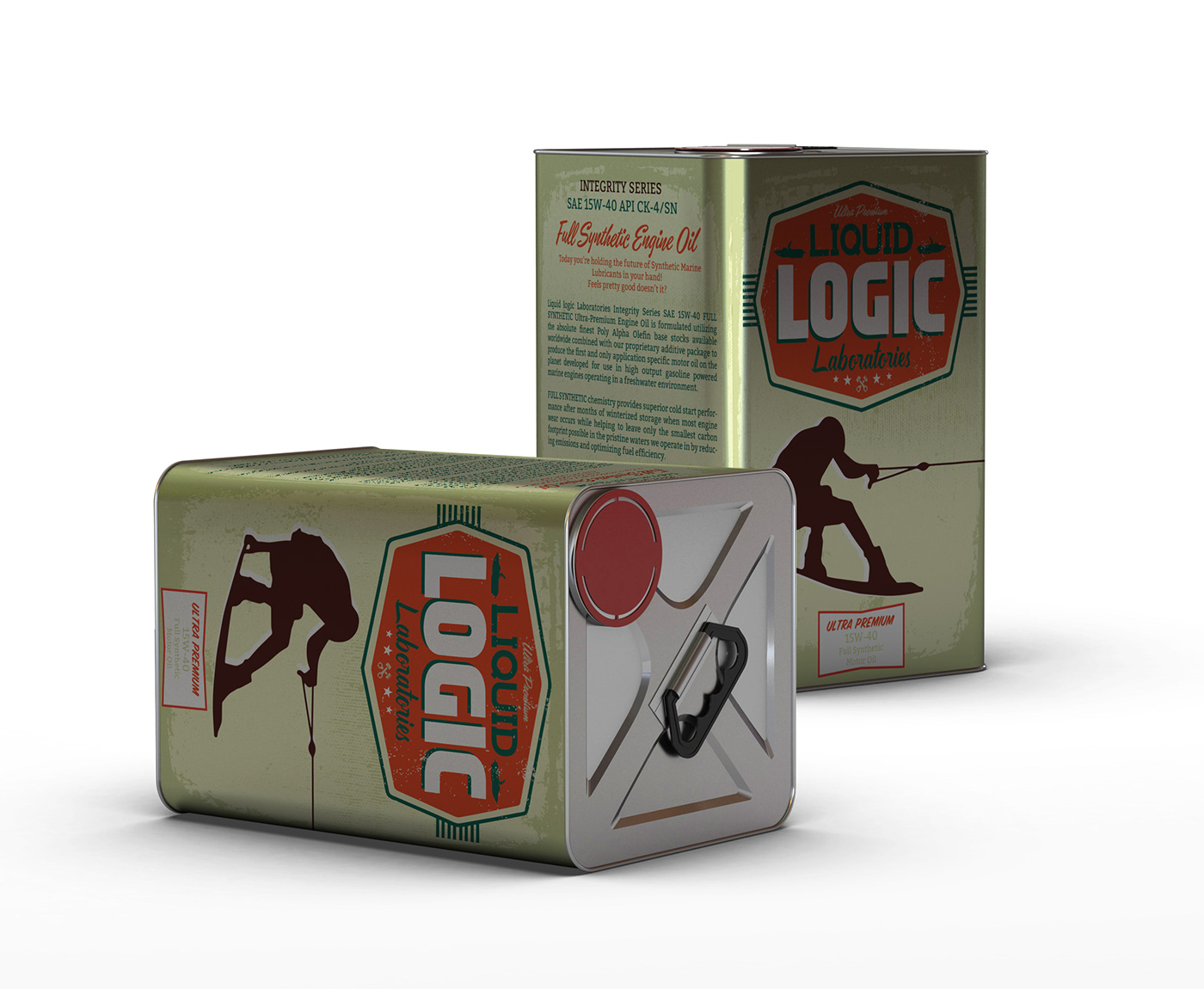
Application Specific Engine Oils and Grease
Malaspina Dog Grooming Service
Rack-A-Tiers Manufacturing designs and distributes innovative, specialty electrical tools. Rack-A-Tiers Manufacturing offers a portfolio of over 140 quality products, each solving real problems that electricians face every day.
Web Site
Advertisement Design: Recylista's Bike Shop
Victoria, Britsh Columbia
”Recyclistas is the hub of Greater Victoria’s grassroots cycling community. We are a full-service bicycle repair shop, recycling depot and educational work space. We have a great selection of new and used parts and accessories and used bikes for sale. Since 2003.”
Web Site
Logo Design: Somerset Interactive
Somerset Interactive Web Solutions
Seattle, Washington
Web Site
The logo for the Margarita Villains Roller Derby Team exudes energy and attitude. With bold lime greens and reds, the sharp typography and villainous character illustration capture the team’s fun yet competitive spirit. The design reflects the intensity of roller derby while adding a mischievous, playful touch to the team’s identity.
Vancouver Island based instrument and sales & repair
Alma Libre Puma's are a 2003 born soccer team from Victoria, British Columbia. They are aspiring to travel to Europe in 2017 for the Gothia Cup in Sweden.
The mandate of BC Randonneurs is to organize rides in accordance to the rules of randonneur cycling as practiced by Audax Club Parisien in France. BC Randonneurs was a founding member in 1983, of Randonneur Mondiaux which organizes brevets 1200 km or longer worldwide.
URBAN Fusion is a modern housekeeping collective that uses nature inspired products and aromatherapy practices to dissolve dirt, build up and stagnancy from your space. Our focus is to clean, clear and add peace of mind to your life.
The logo for M.J. Olsen Construction is a clean, minimalist design that highlights the company’s expertise in woodworking and custom craftsmanship. The simplicity of the logo reflects the precision and attention to detail inherent in their work. Subtle elements of measurement, like ruler or caliper-inspired lines, are incorporated to emphasize the technical skill involved in each project. The logo also features a nod to the custom bent wood framing (often referred to as “steam bending” or “curved woodwork”), with smooth, flowing lines that suggest the organic curves of wood being shaped into beautiful, functional structures. This design effectively communicates M.J. Olsen Construction’s dedication to quality, craftsmanship, and the art of woodworking, while maintaining a modern, professional appeal.
